PropTech — post-purchase customer experience · 2022–2023
Houseplus Post-Purchase
Turning a paper-heavy home-buying process into clear next steps within an established enterprise workflow.
- Client
- Nam Long Group (via Smarty Process Solution)
- Role
- UI/UX Designer
- Outcome
- Stakeholder research · UX design · shipped to pilot
Context
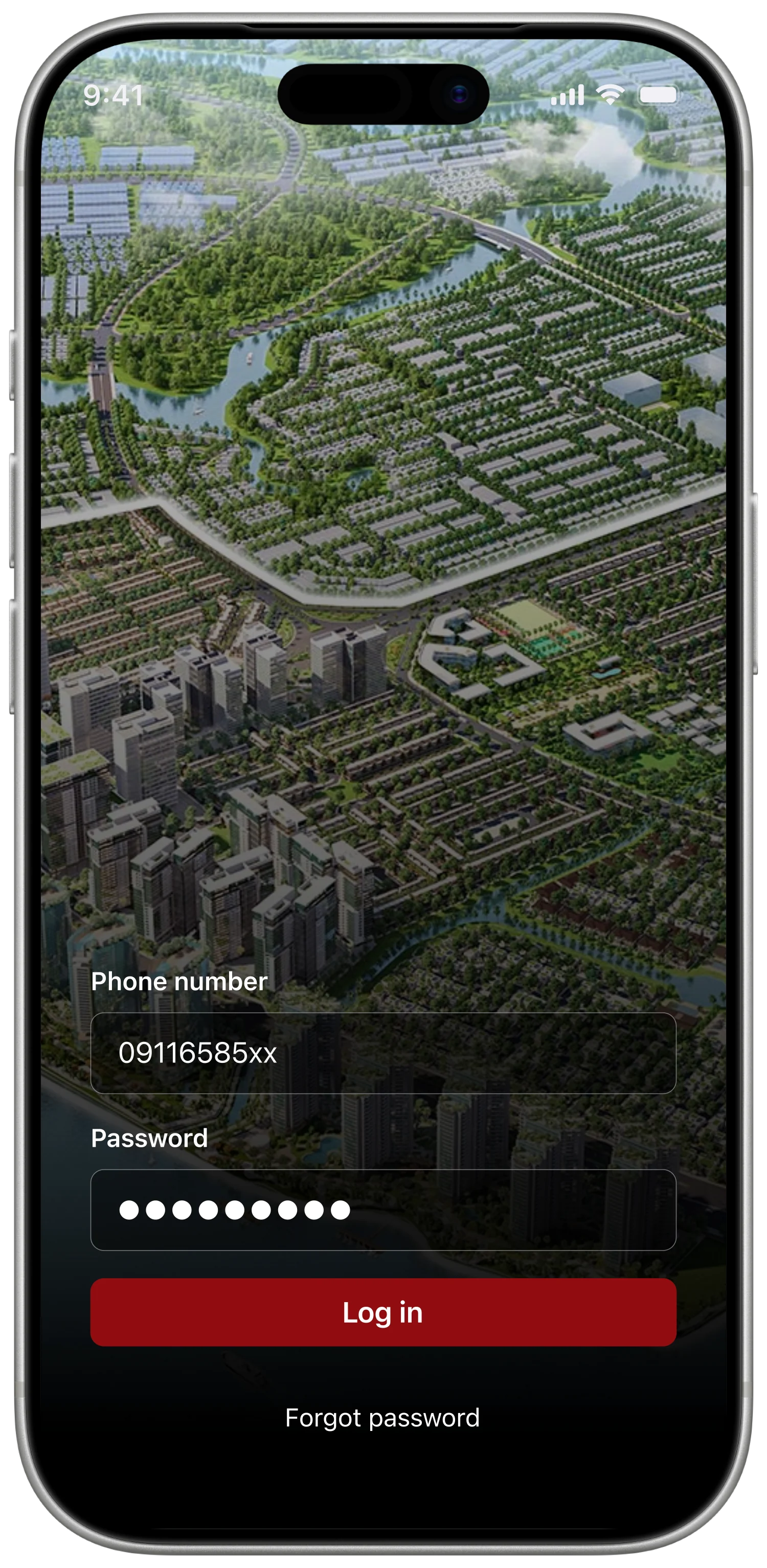
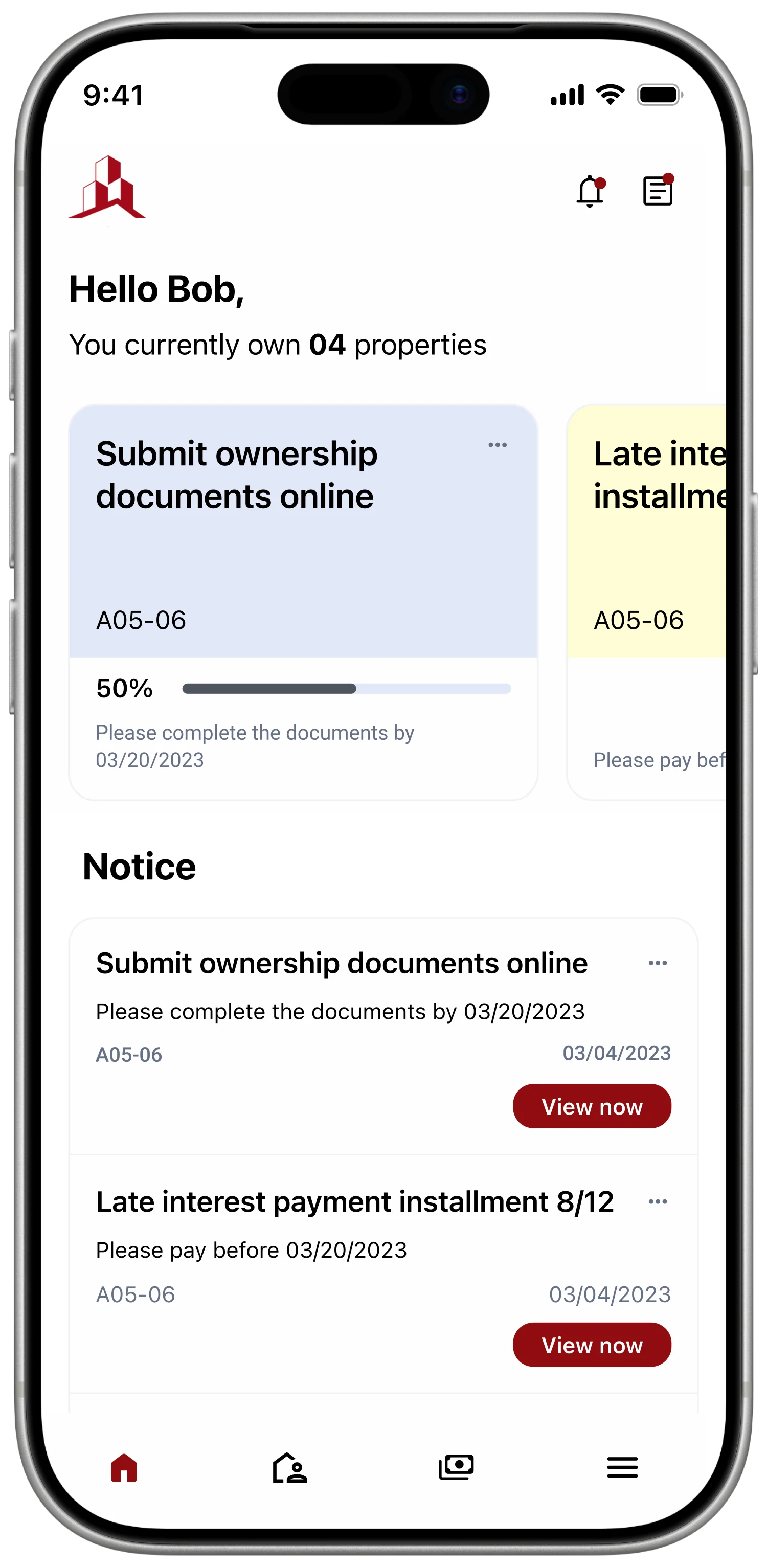
Houseplus was a post-purchase product for Nam Long Group, delivered through Smarty Process Solution. It brought payments, documents, appointments, and property management into one buyer-facing experience. Behind it sat an established IBM BPM system that owned the business rules, approval paths, and operational data.
I worked as a UI/UX Designer across research synthesis, journey mapping, interaction design, interface design, and the shared design system. The central constraint was clear: improve how buyers understood and completed the process without changing rules the business had already operationalised.
Problem
After purchasing a home, buyers had to navigate installment payments, document submissions, appointments, and handover requirements through paper contracts, phone calls, email reminders, and instructions spread across multiple touchpoints. Missing a step or entering the wrong information could be difficult to resolve, especially when the action involved a large payment or legal document.
The same fragmentation affected internal teams. Sales, customer service, and debt management relied on filing cabinets, Excel sheets, and separate conversations to understand a buyer's status. The product needed to guide the buyer while giving staff a clearer view of the same process.
The Challenges
- Ownership and handover processes are very complex and involve many special cases
- Information security is crucial — records and payment details must be safe
- The application needs to handle a large amount of data
- Working within technical constraints (existing IBM BPM workflows)
The Objectives
- Optimise processes, simplify complicated ones, automate repetitive or time-consuming tasks
- Conduct user research — surveys and interviews — to gain insights into goals, motivations, and pain points
- Work within technical constraints while still delivering an app that meets users’ needs and expectations
Evidence
The available research consisted of interviews with five internal employees across sales, customer service, and debt management. These were stakeholder accounts of supporting buyers, rather than interviews with buyers themselves. Across the conversations, three recurring difficulties emerged: anxiety about entering payment information incorrectly, repeated document corrections, and difficulty reaching support through a busy hotline.
I organised those accounts into an empathy map, then mapped the post-purchase journey from app access through payment, document submission, appointment booking, handover, and property management. The journey map gave the team a shared view of where a buyer could become uncertain and which internal team had to respond.
Say & Do
- Submitting documents online via email
- Missing or incorrect documents when submitting on paper
- Receiving and signing the handover protocol when taking possession of the new house
- Reporting errors and requesting warranty service over the phone
See
- Model apartment or show apartment
- 3D view
- Architecture
Think & Feel
- Frustrated when calling the hotline and it’s always busy
- Anxious about making a mistake on a large transfer with the wrong message
- Happy about buying a new house
Hear
- Sales pitch from staff
- General information about the real-estate project and future vision
A synthesis of five internal stakeholder interviews. It records employee observations about buyer difficulties and defines hypotheses for the design.
| Row | Outside app App install | Outside app Login / signup | Explore app Home & menu | Explore app Appointment booking | Explore app Notification | Explore app Payment | Explore app Submit document online | Explore app Submit paper document | Explore app Property management |
|---|---|---|---|---|---|---|---|---|---|
| Touchpoint | Store listing | Auth screen | Navigation, featured items | Calendar booking process | Notification tab | Payment process | Online submit process | Timeline displayed | Process timeline |
| Feeling | “Easy to find but takes a while to download.” | “Help me add a fingerprint please.” | “Is there a way to make it load faster?” | “If I schedule an appointment that conflicts with someone else’s, what should I do?” | “Is there any way to sort my notifications?” | “The message is too long and complicated — if I get it wrong, what should I do?” | “Are there any other processes that can be done online?” | “I have to travel between three locations just to submit a document.” | “If I purchase another apartment, will it be updated immediately?” |
| Experience | Download via the link provided by the company | Provided with an existing account and password | Easy to search various options | Schedule appointment via app | Receive quick notifications as soon as there is an issue | Payment via smart banking or bank transfer | Submit personal documents online | Printing, filling out information, signing, and submitting in-person at the counter | Clear and personalised apartment information |
| Pain point | Time-consuming download | Enter password every time | Can’t see the tasks that need to be done quickly | Double-booking or incorrect scheduling | Difficult to follow | Incorrect payment information | Concerns about information security | Difficulty travelling between locations | Not optimised for multiple projects |
| Possible solution | Reduce download size | Use Smart OTP or biometric security | Highlight the urgent tasks | Suggest a suitable time slot, lock already-scheduled slots | Classify notification content | Pre-written messages with correct syntax + copy function | Commitment to information security | Minimize errors so customers avoid moving around to prepare documents | Reasonable information classification |
Reframing
The brief initially focused on replacing paper, phone calls, and Excel tracking. The stakeholder evidence suggested a more useful design principle: digitisation only helps when a buyer can understand what to do next, complete it correctly, and reach support before a mistake becomes expensive to fix.
Make the next payment or paperwork step clear before a mistake becomes difficult to resolve.
This principle became the test for each proposed feature. A screen had to clarify the next obligation or help the buyer resolve uncertainty; reproducing the existing process on a phone was not enough.
Decisions
Show the next payment and prepare the transfer message
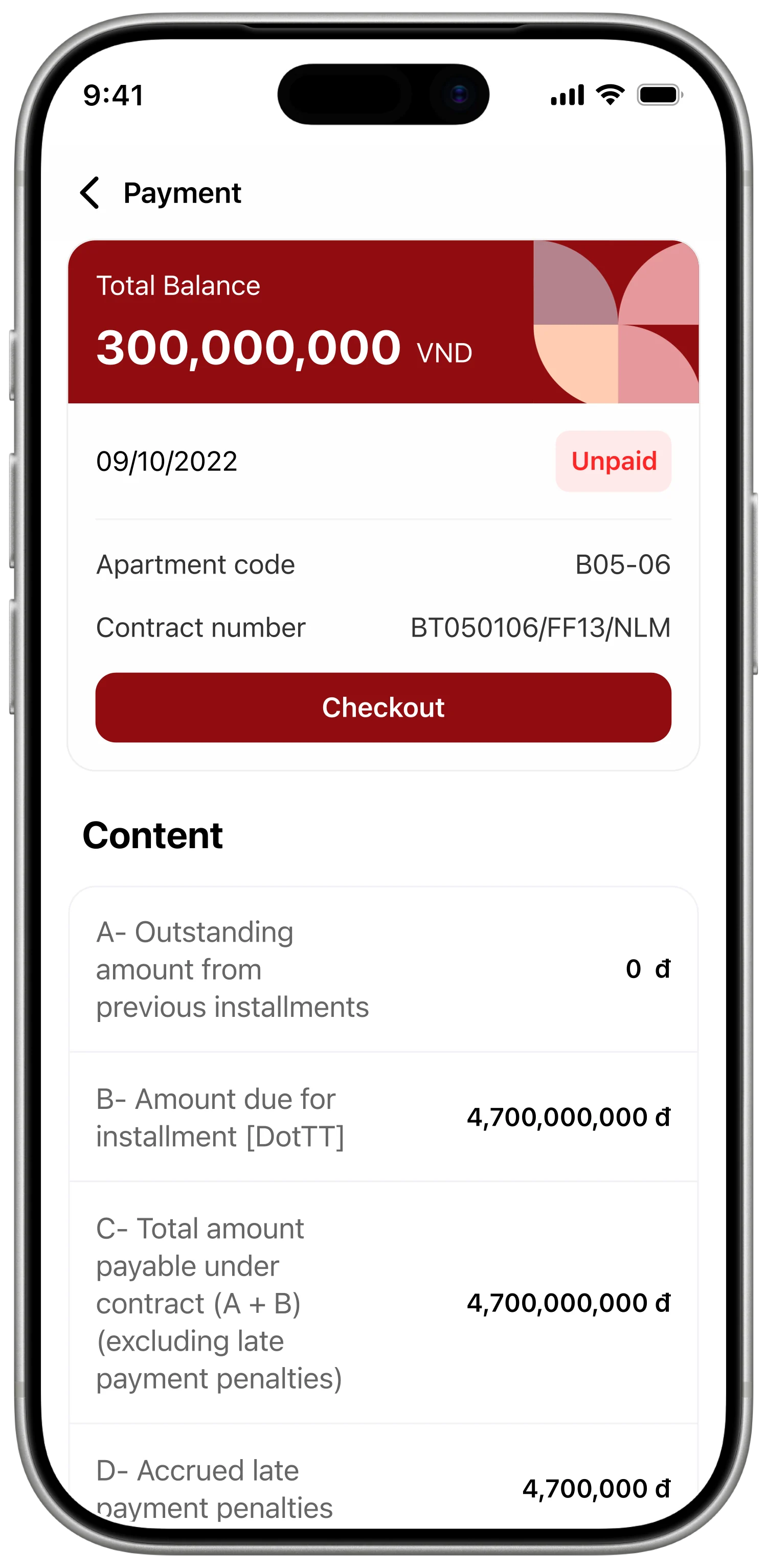
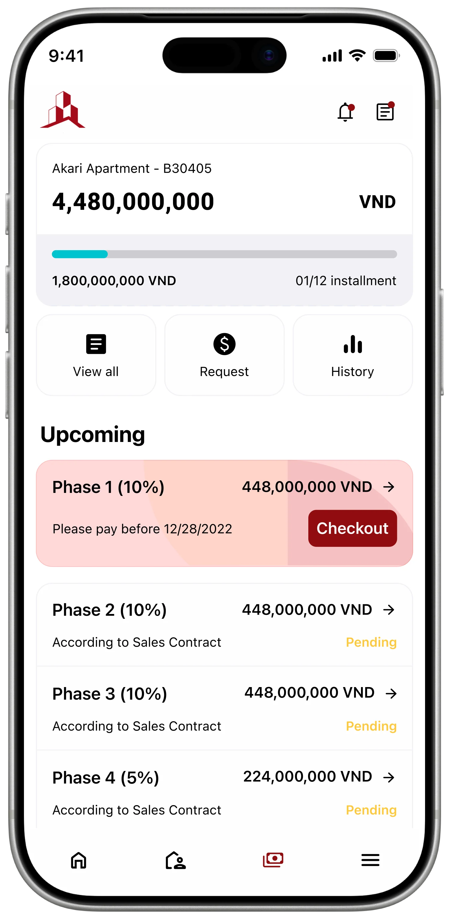
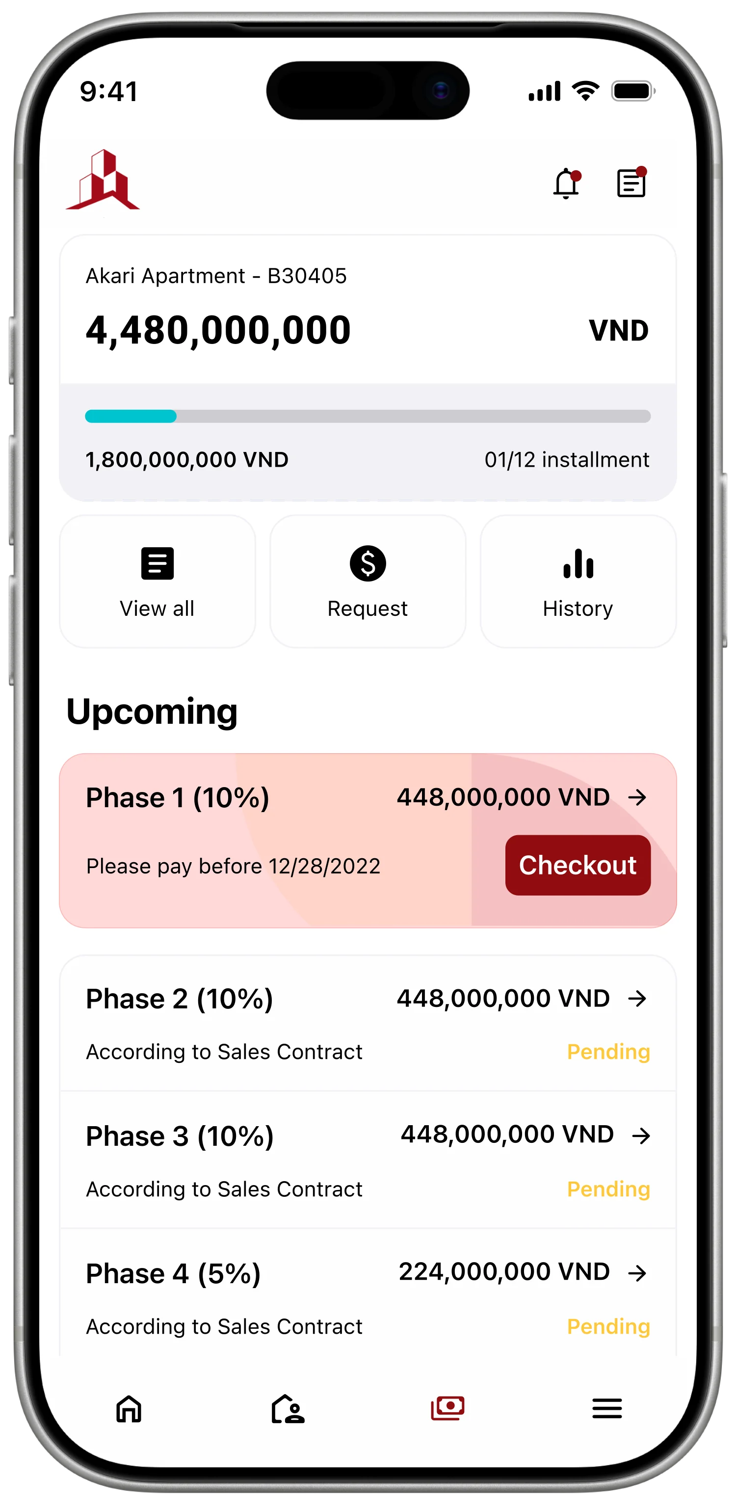
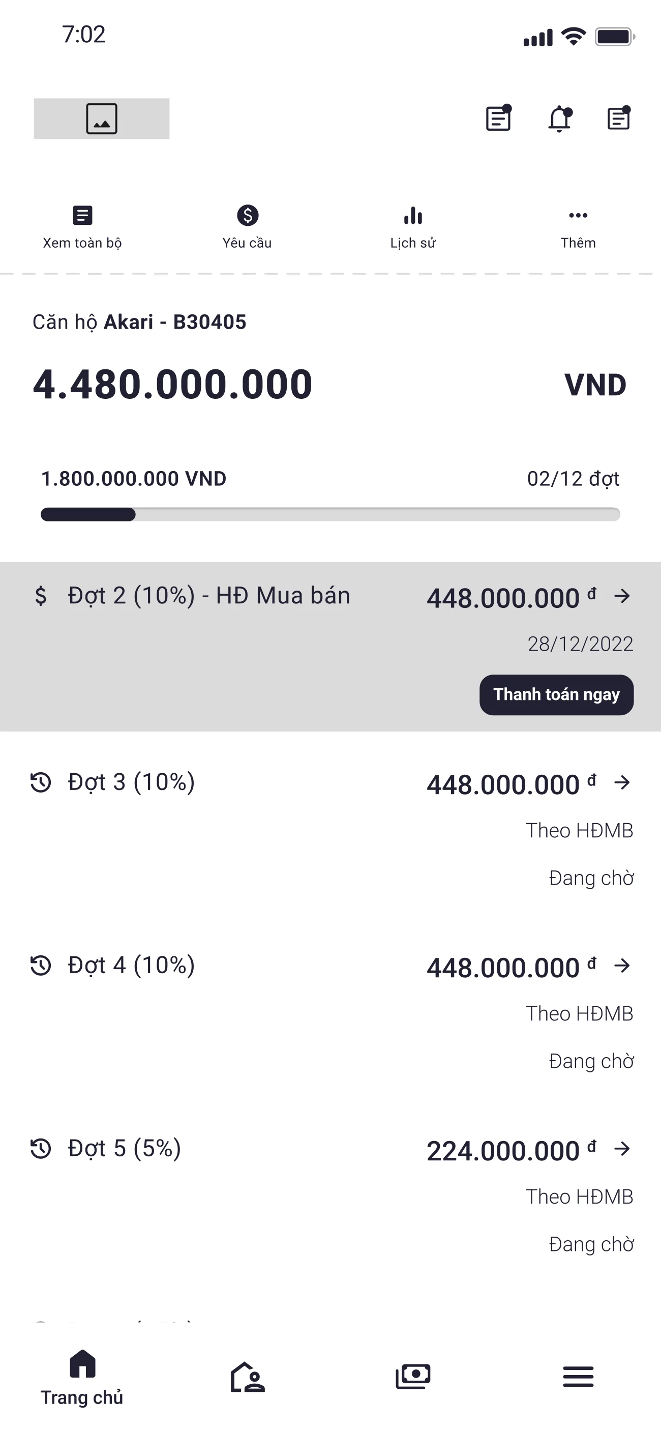
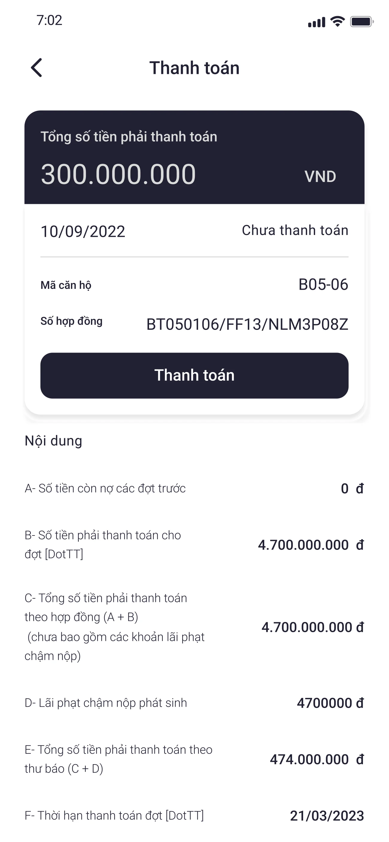
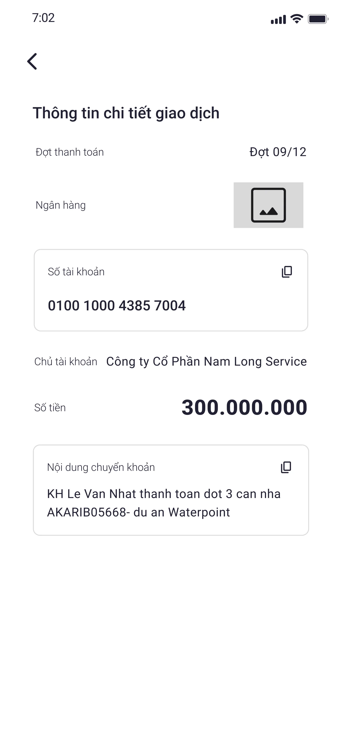
Stakeholders described recurring concern about payment status and incorrect transfer information. I proposed a visual timeline showing paid, due, and upcoming stages, paired with a prepared transfer message containing the recipient, account, amount, and reference code. The design reduced the information buyers had to assemble manually before making a transfer.
Finance and sales teams would need to keep message templates aligned with account and reference conventions.
Payment timeline · the buyer’s mental model
A vertical timeline of every milestone — deposit, contract, instalments, handover, ownership — each marked Paid, Due, or Upcoming. The buyer always knows where they stand without asking sales or scrolling through email.
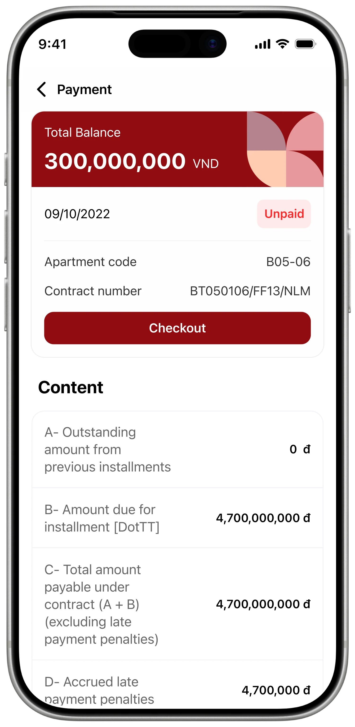
Pre-written transfer message · removes the typo risk
Recipient, account, amount, and reference code are pre-filled in canonical syntax. One-tap copy. A short banner explains why the syntax matters, so the buyer never types out a billion-VND transfer message.
Guide documents by buyer type and review state
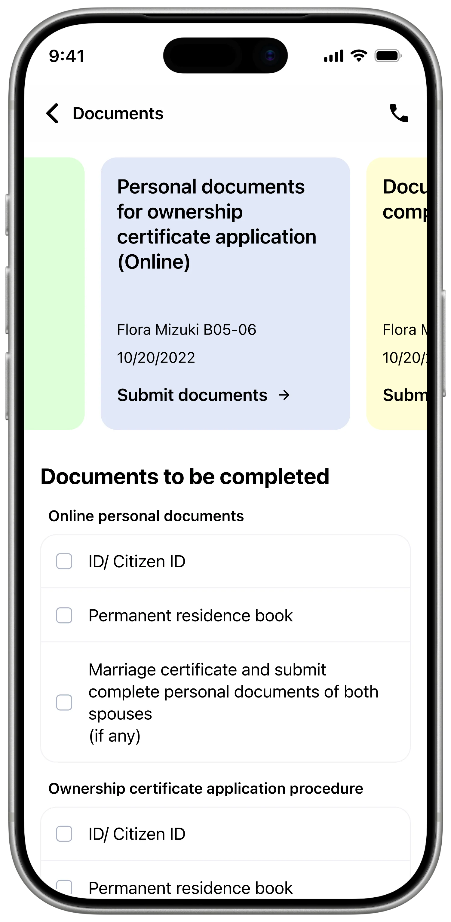
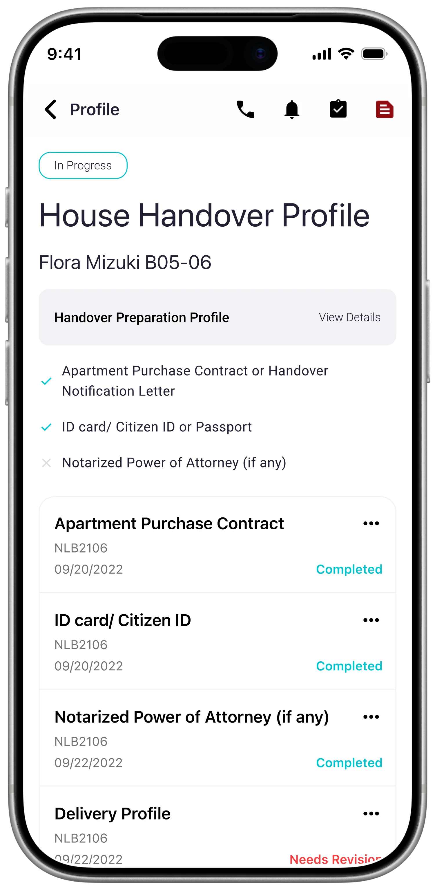
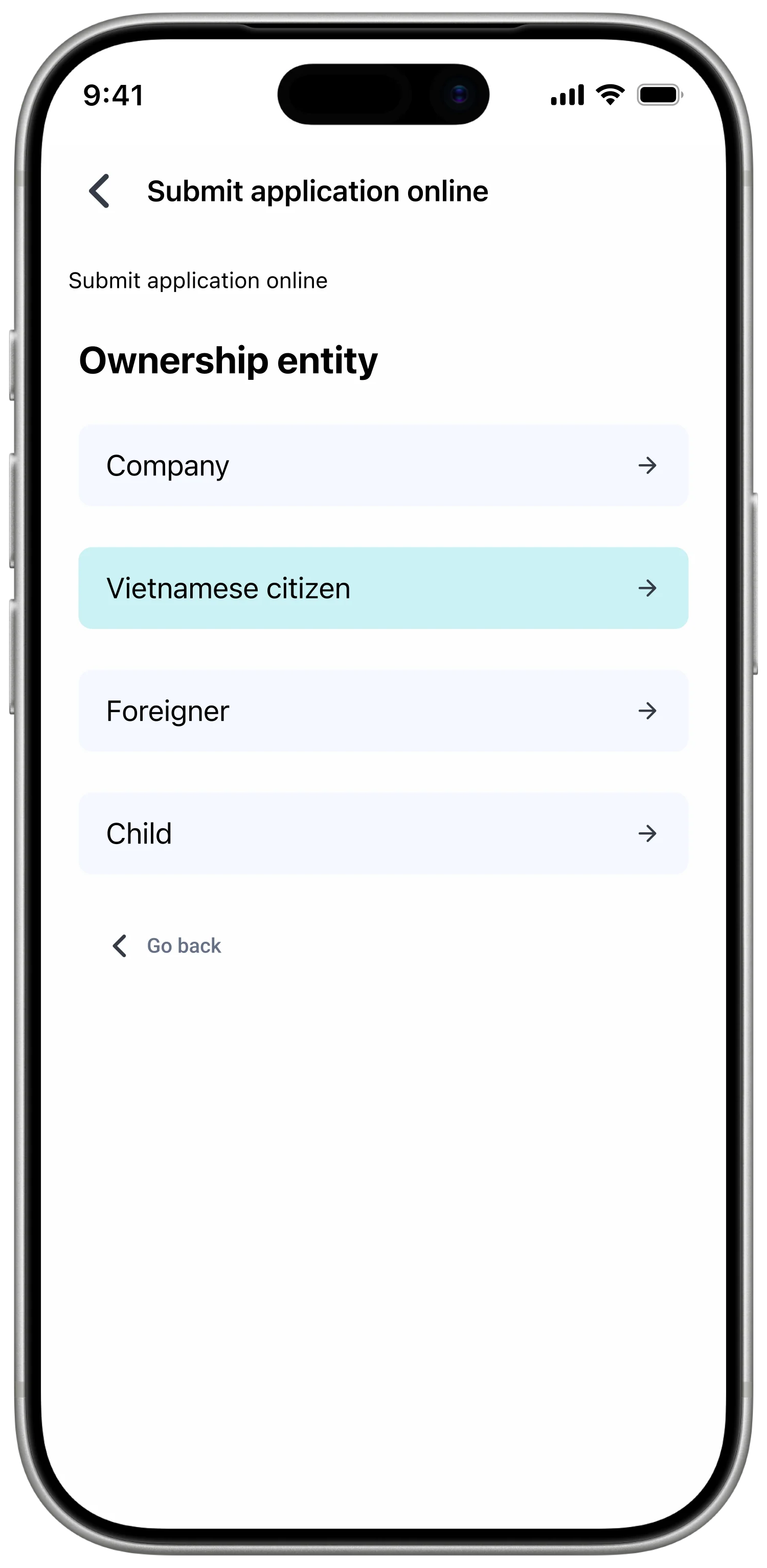
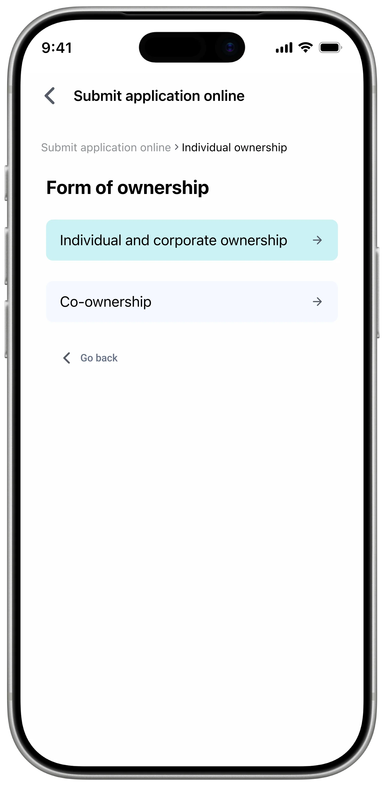
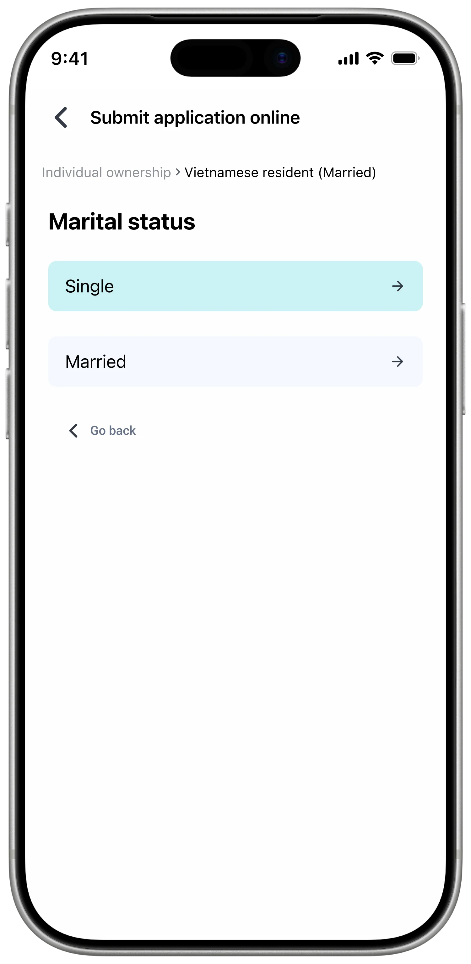
Incorrect or incomplete paperwork created repeated corrections and travel between locations. I grouped requirements by buyer type and placed required fields, examples, capture guidance, and review status inside one submission flow. Buyers could see what was required before sending a document and what needed correction afterward.
Every document type requires maintained plain-language guidance and an accurate example.
Give support a scheduled and contextual route
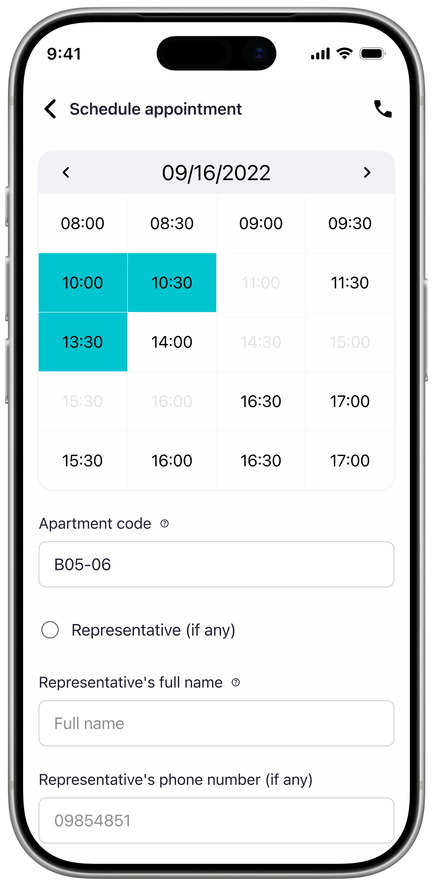
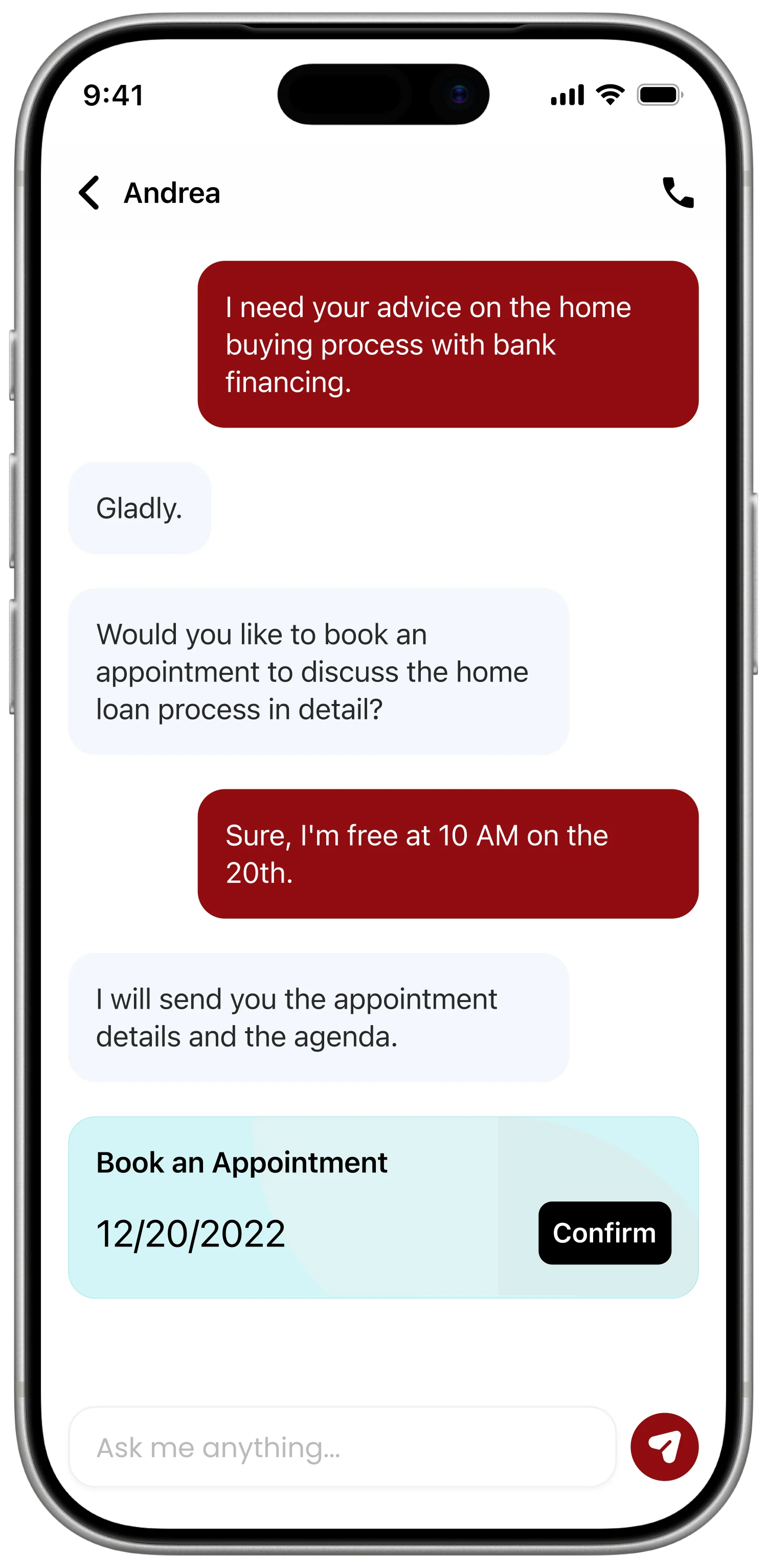
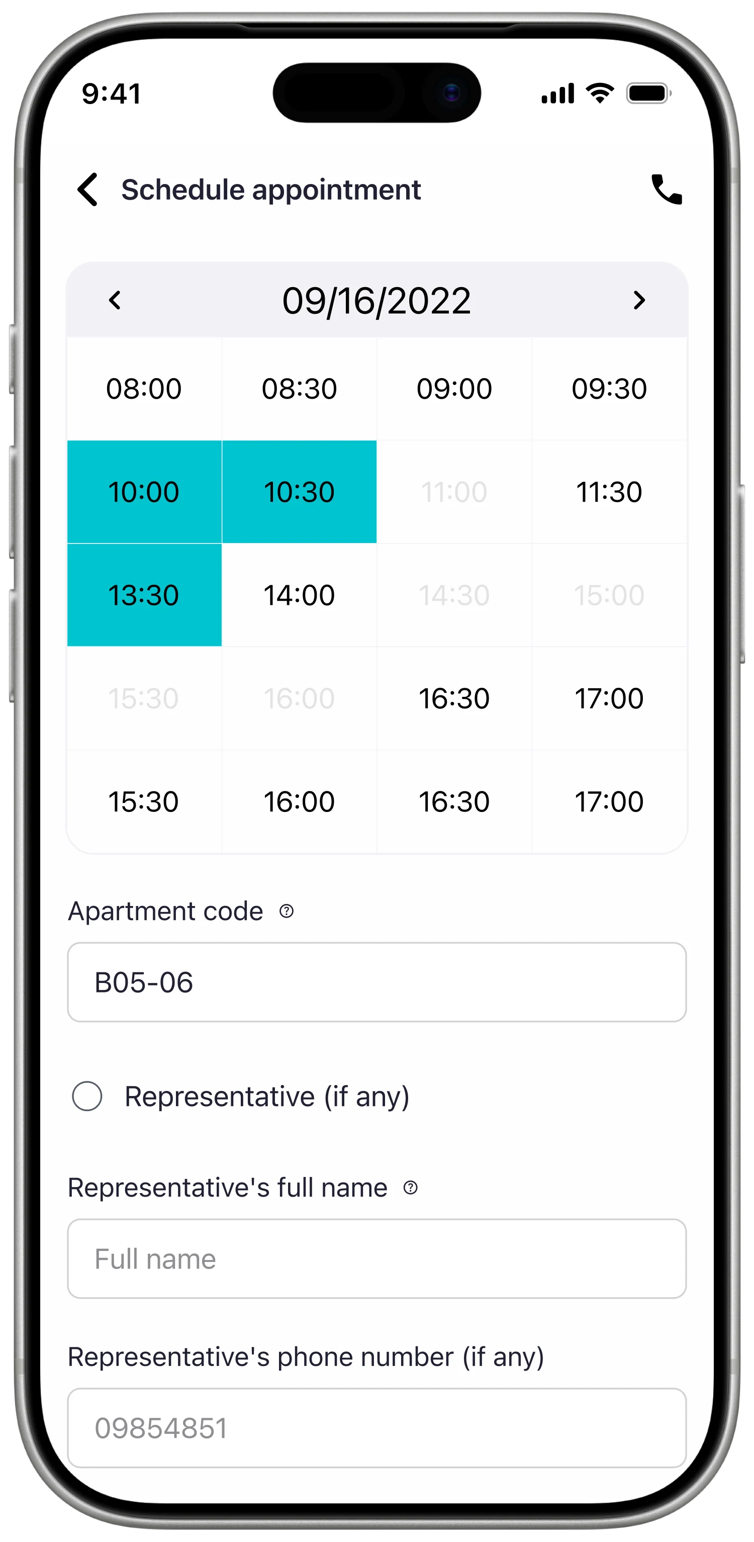
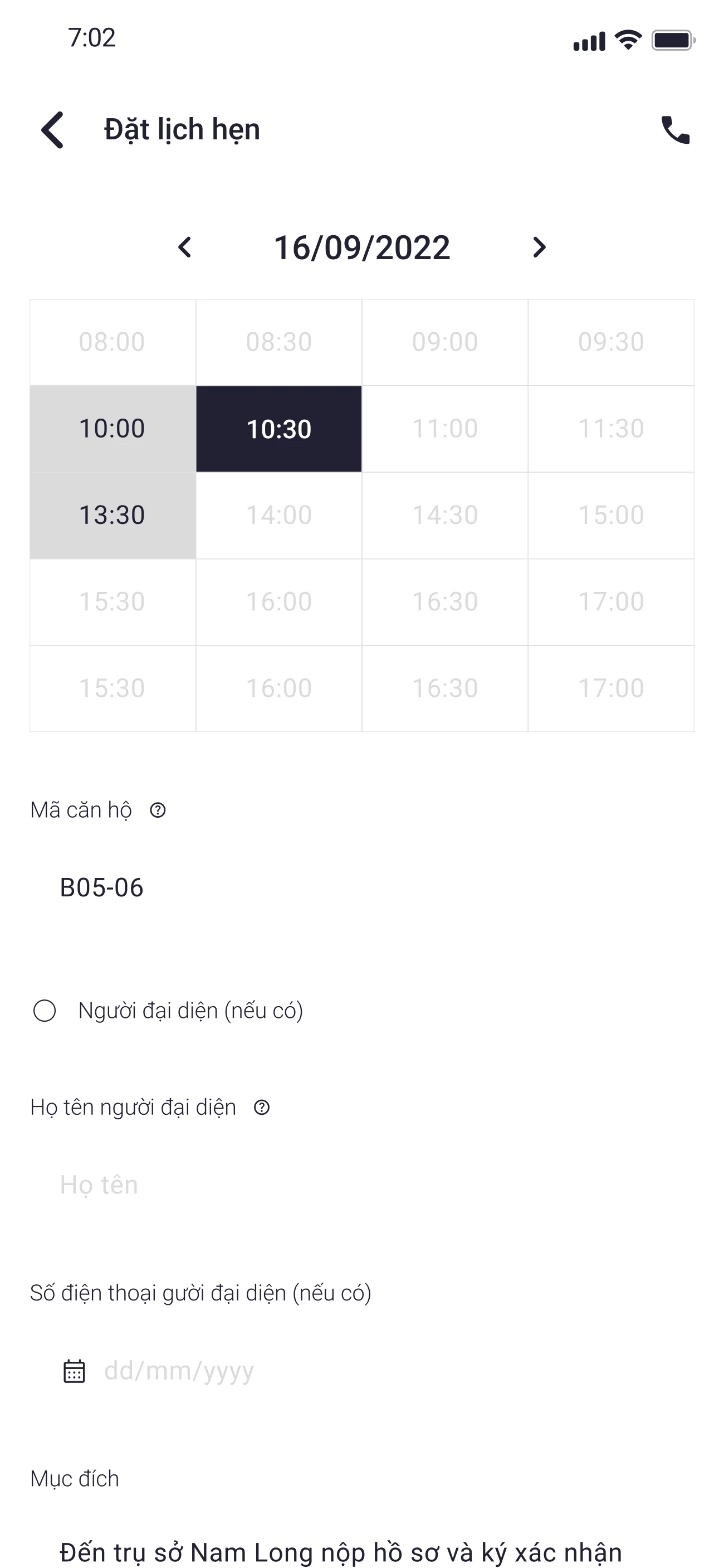
The busy hotline left buyers without a predictable way to resolve shorter questions. I proposed appointment booking with an assigned customer-service representative and an in-app conversation linked to common tasks such as rescheduling, retrieving payment details, or supplying a missing document.
The experience depends on customer-service capacity, maintained availability, and clear ownership of incoming conversations.
Execution
I started with low-fidelity wireframes across payments, documents, appointments, handover, and shared account surfaces. This let the team review hierarchy, navigation, system states, and the point of each action before visual styling made the flows appear more resolved than they were.
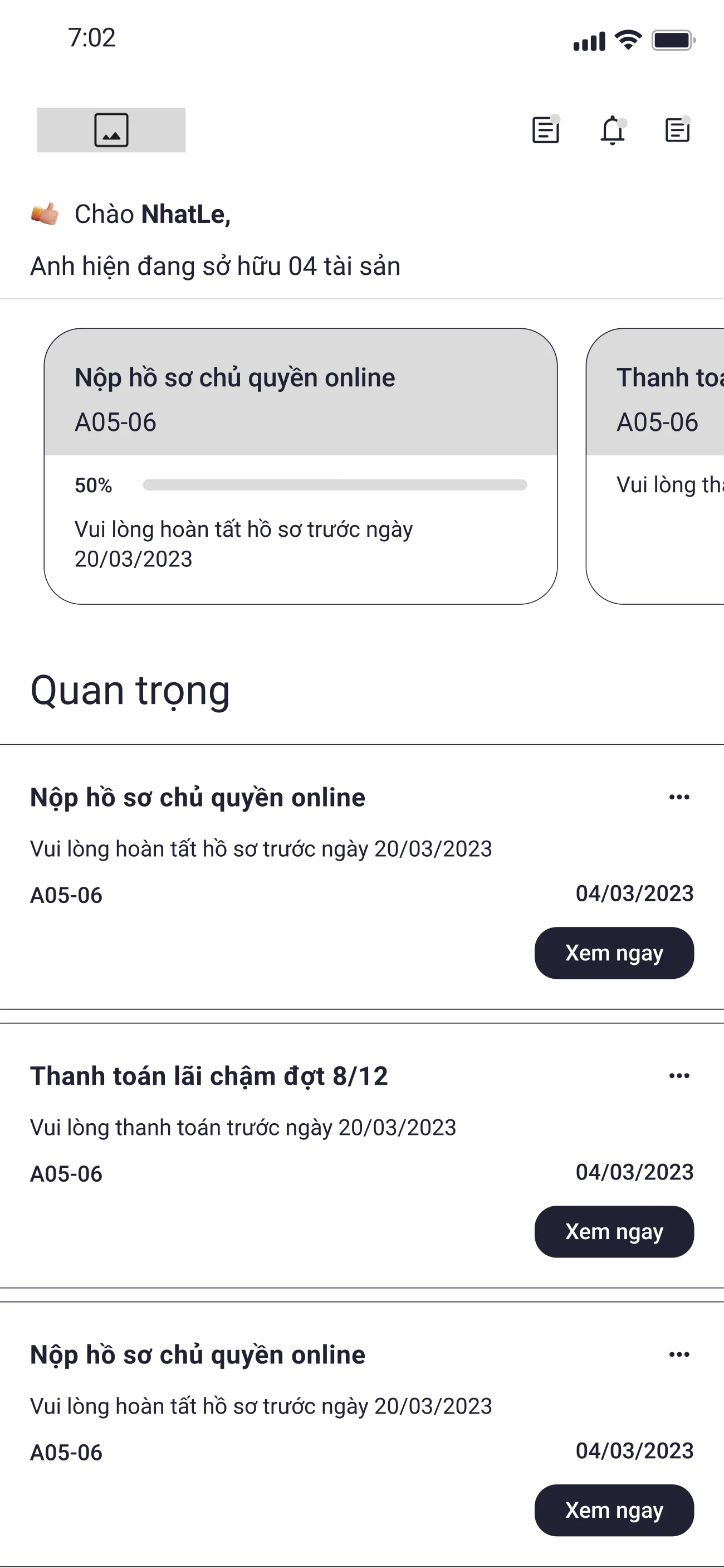
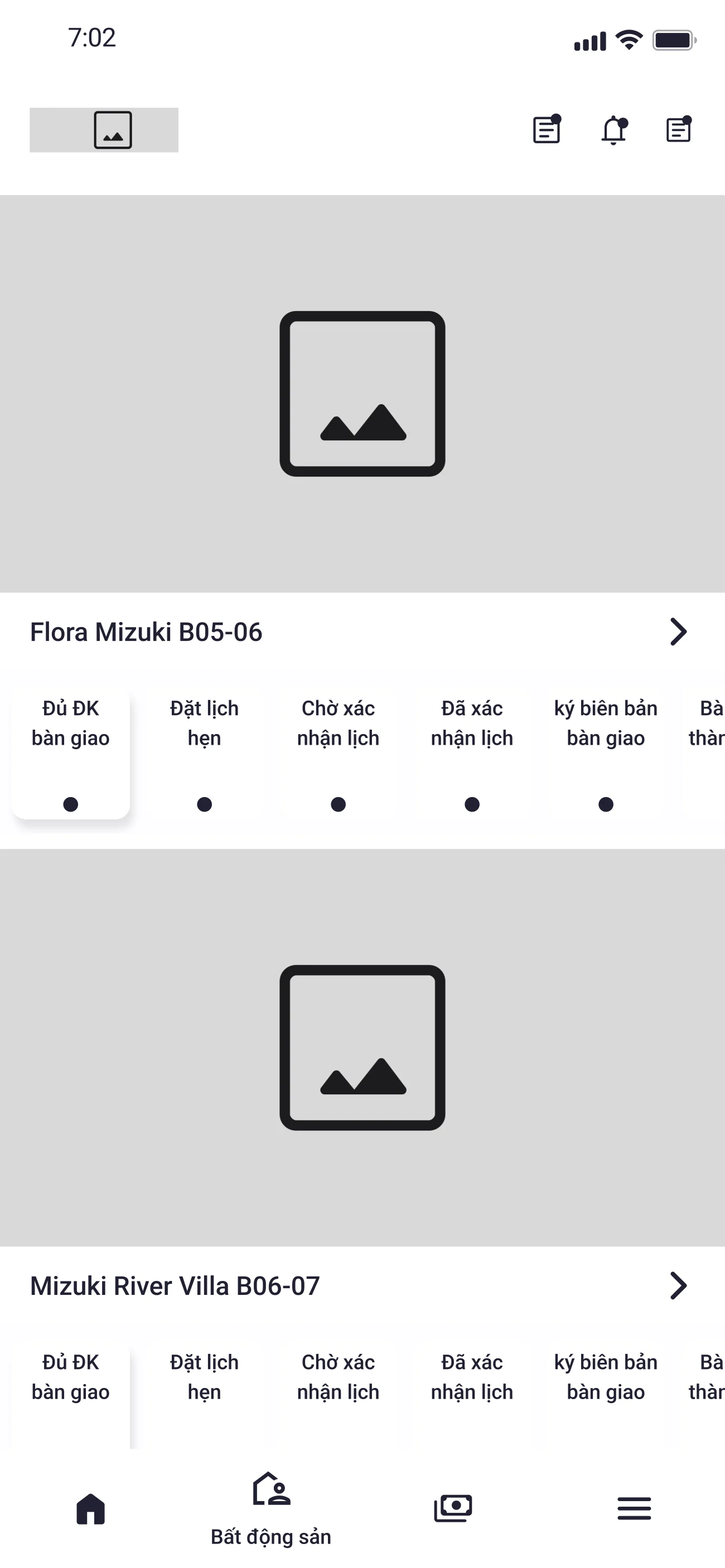
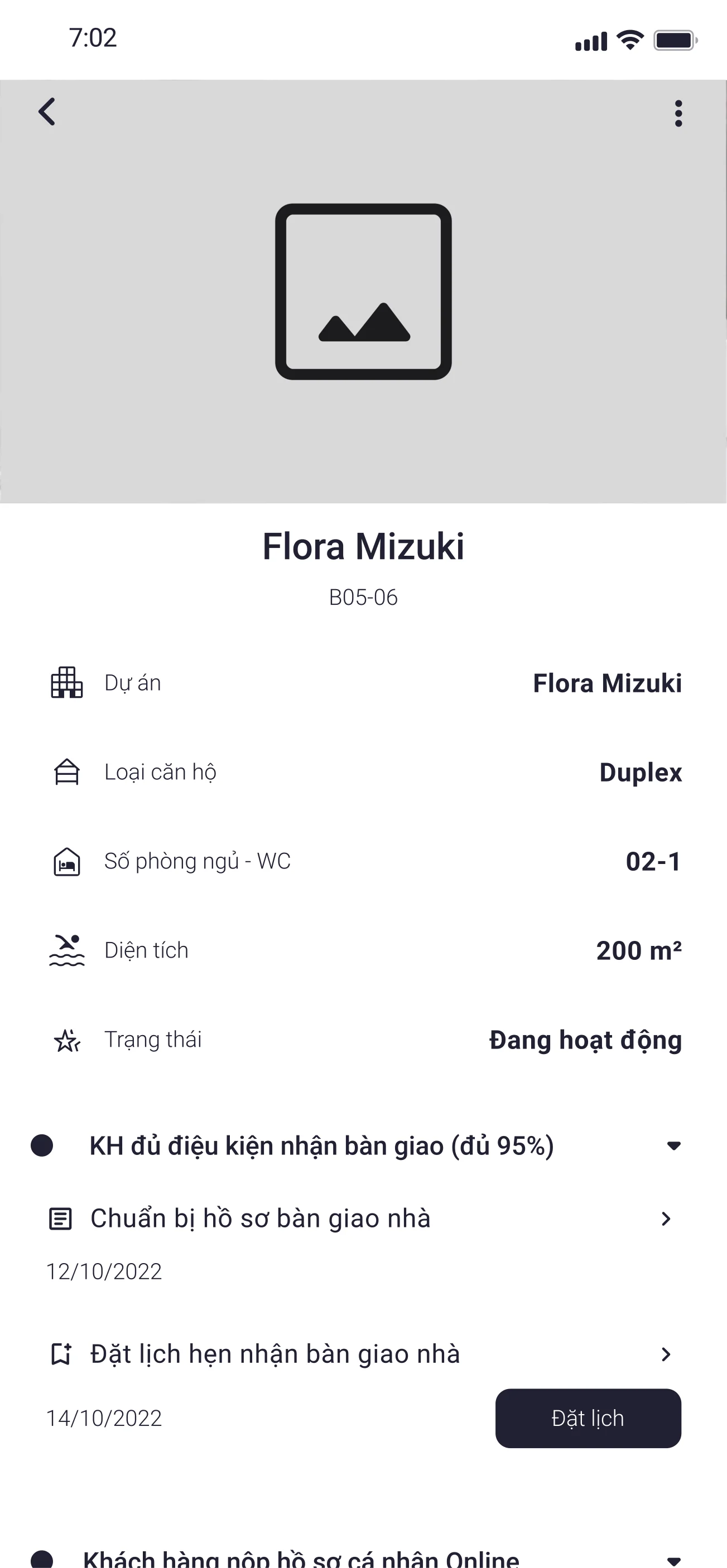
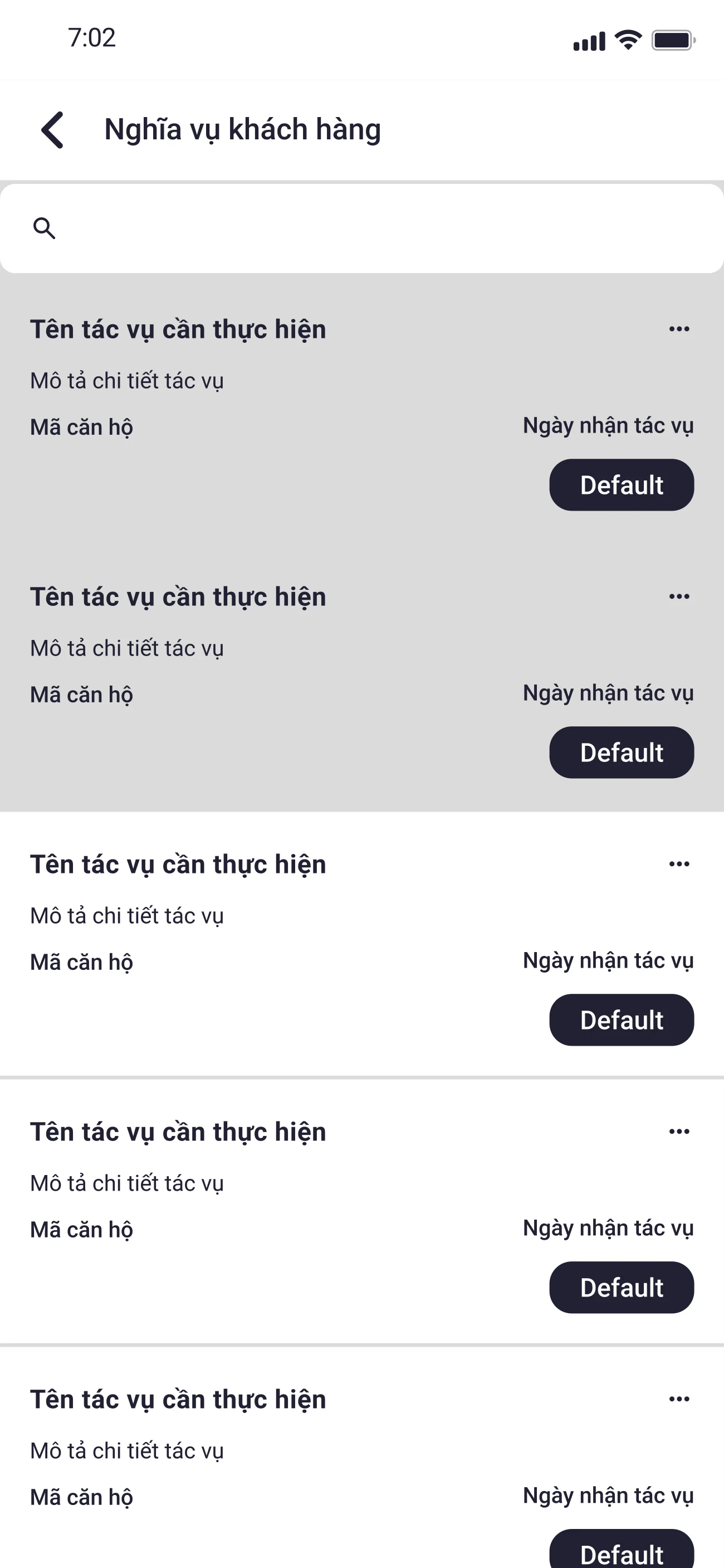
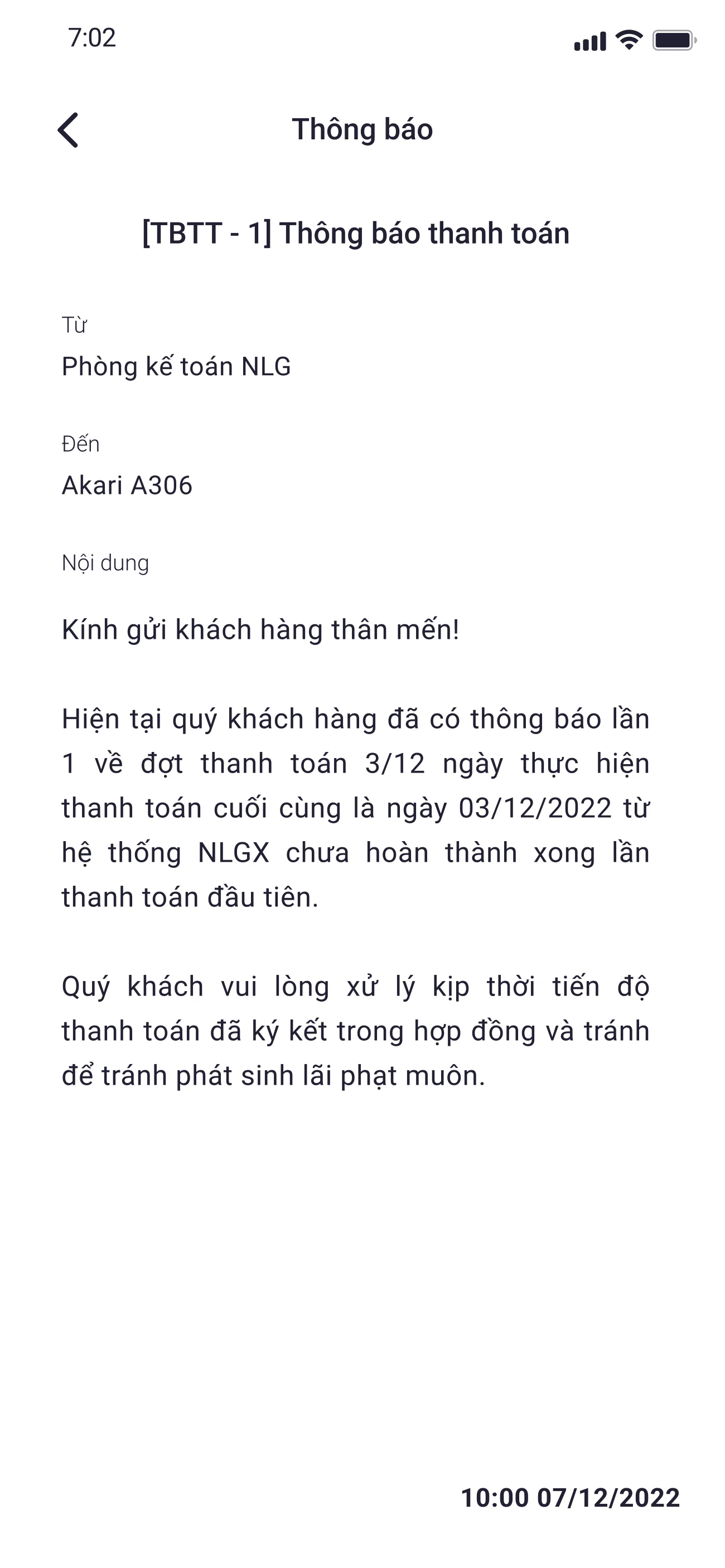
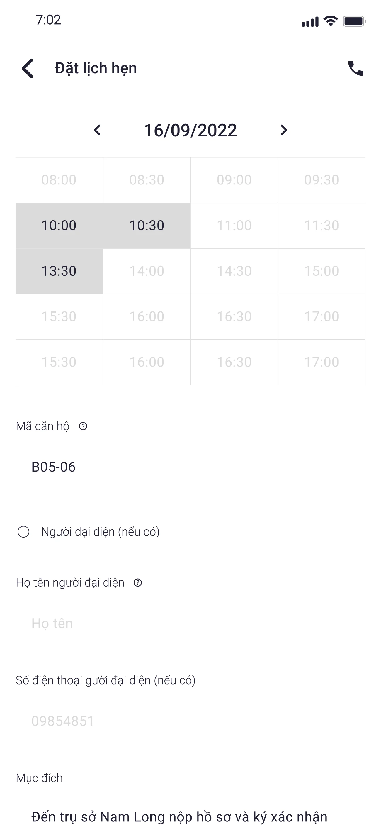
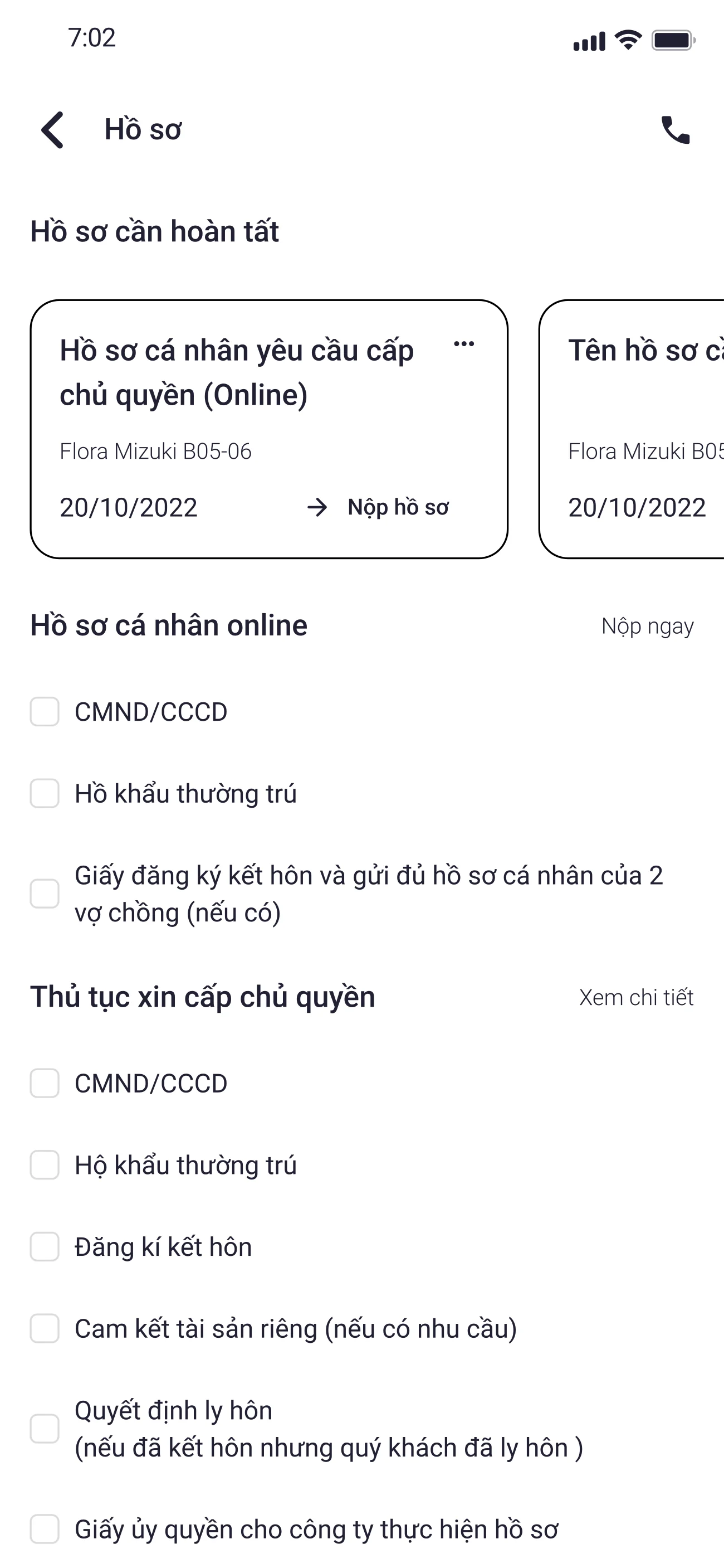
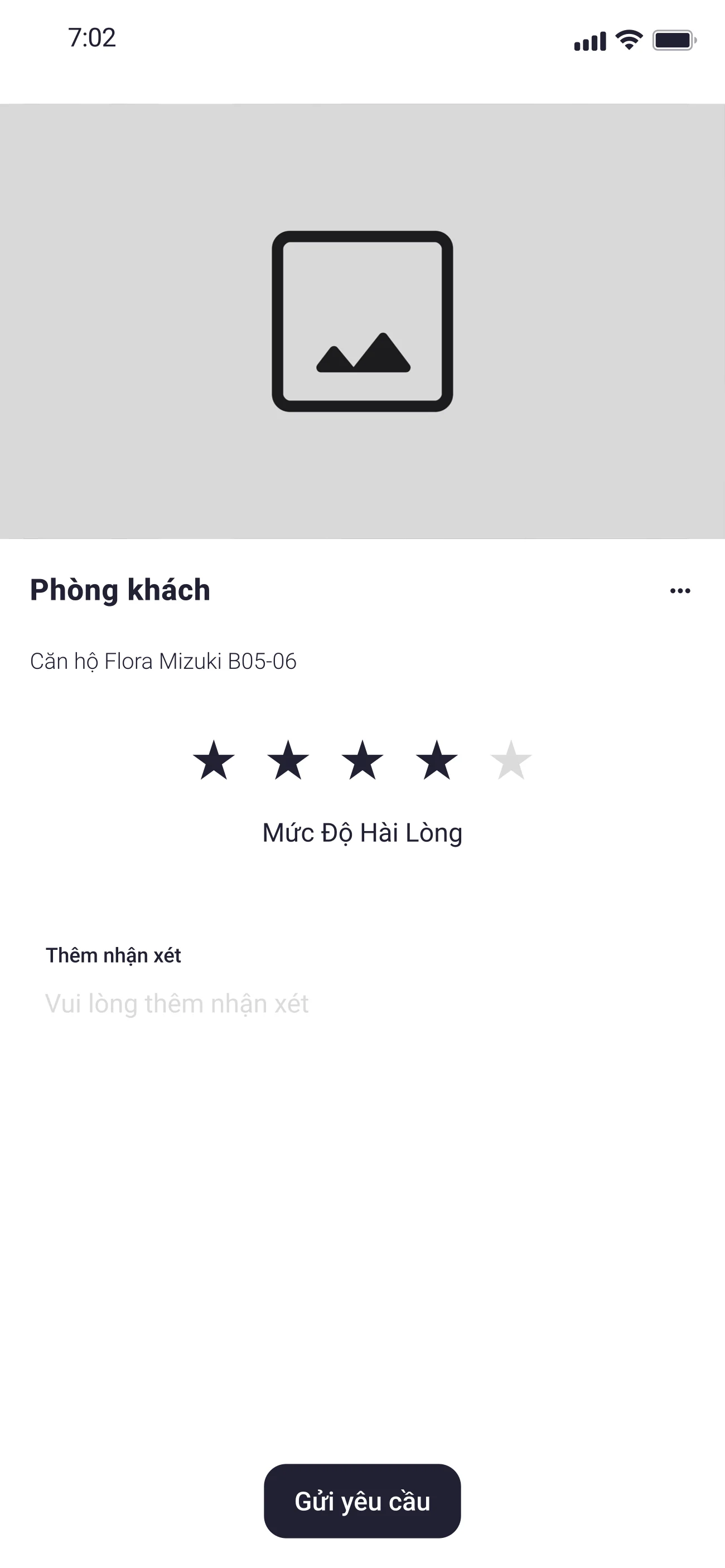
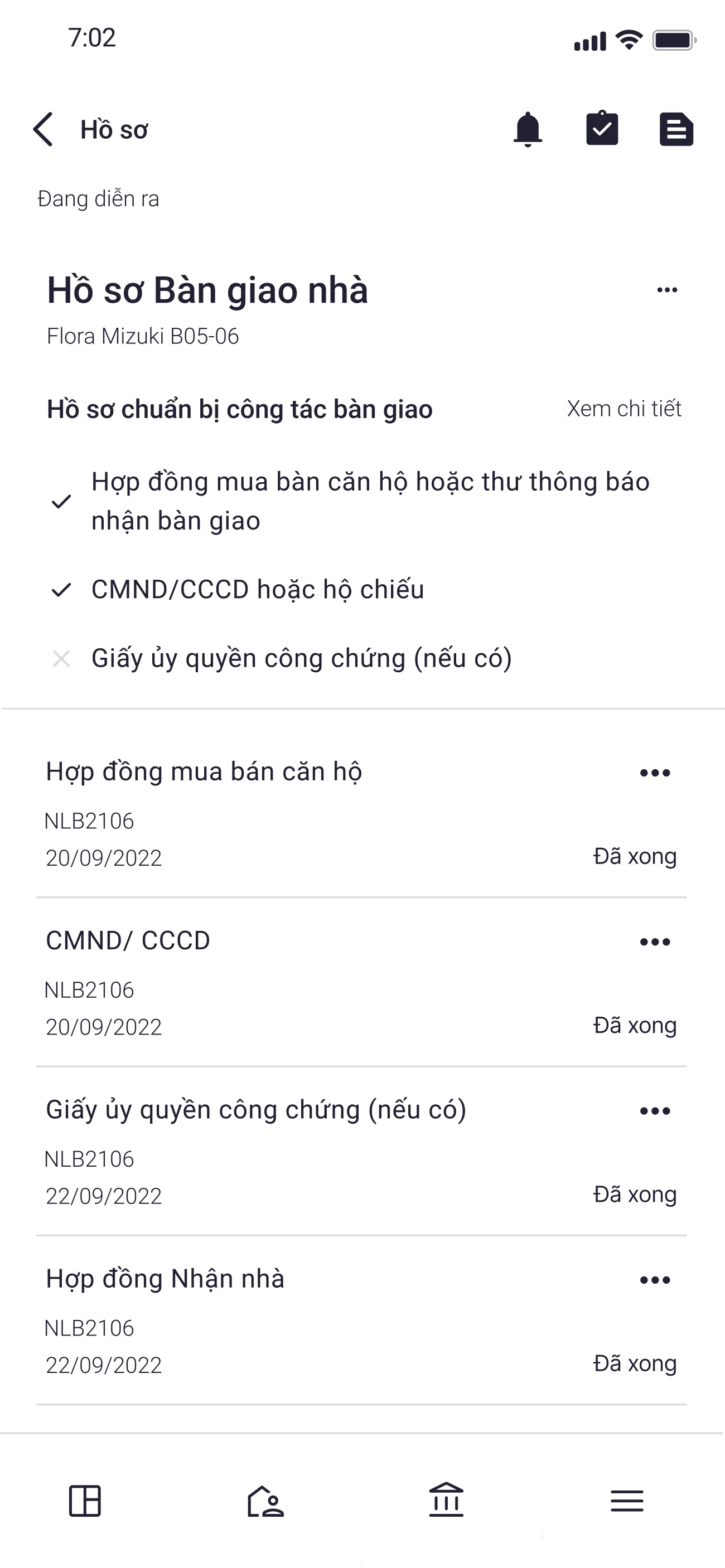
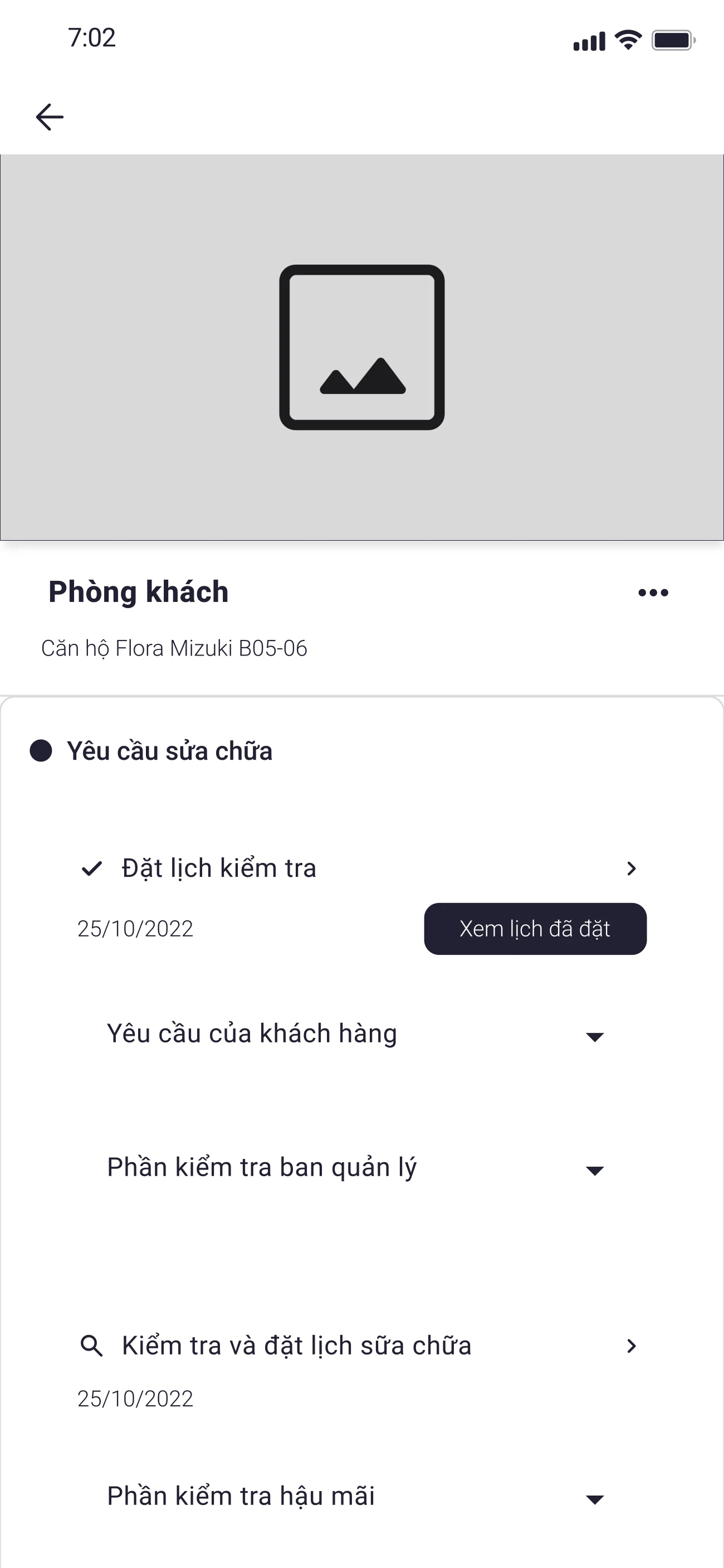
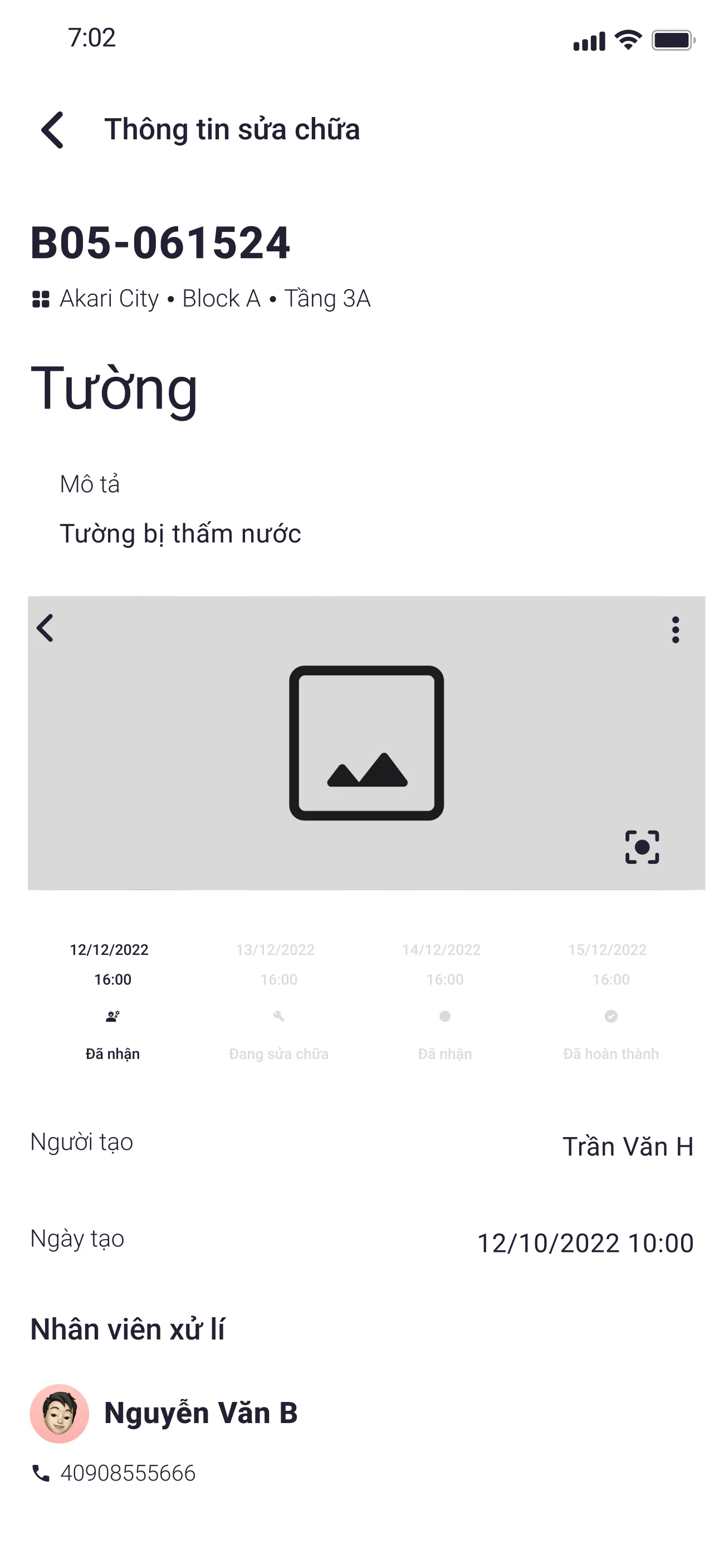
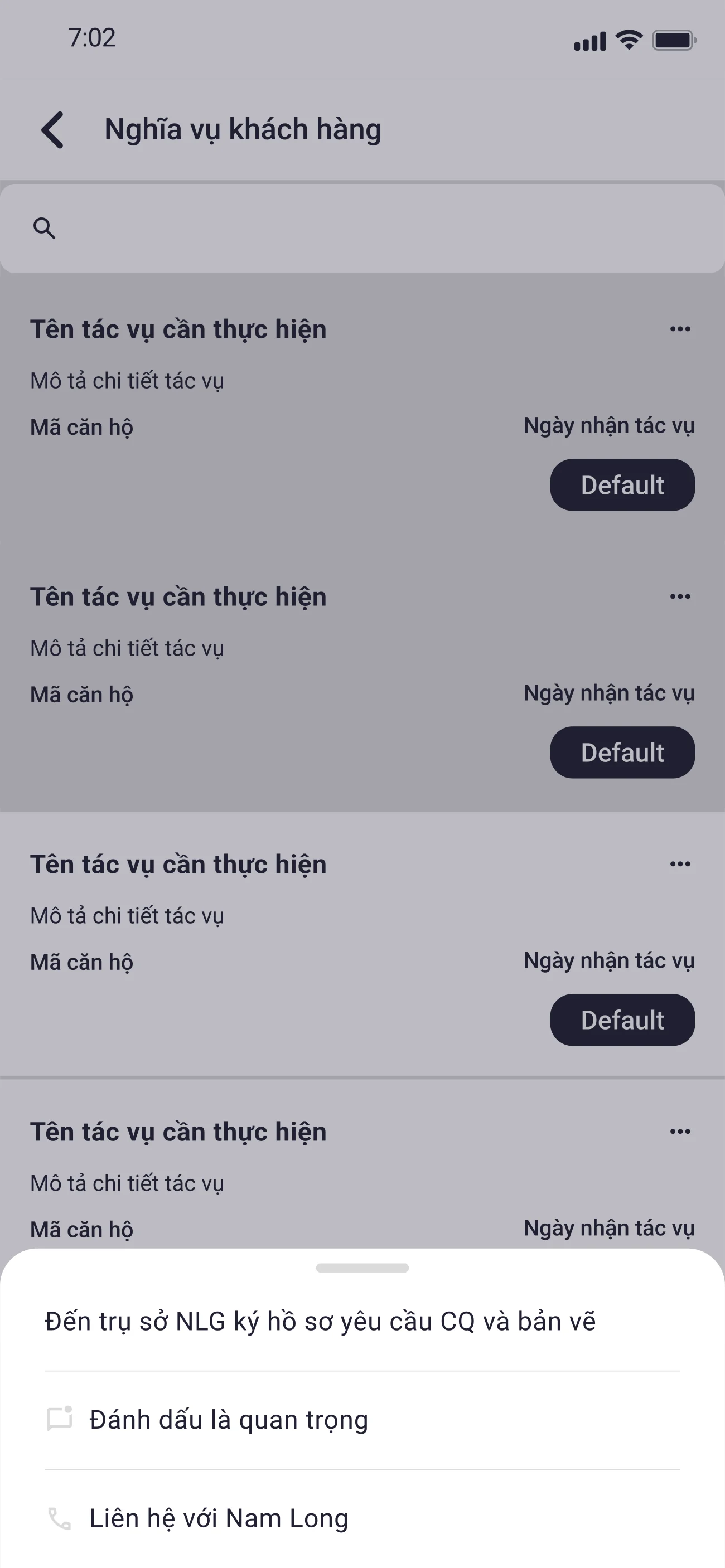
I then built reusable typography, colour, status, input, and navigation patterns for the buyer-facing app and related internal surfaces. The design system was created alongside delivery rather than as a separate funded track, so it served as a practical consistency layer and handoff foundation. It was functional, though less mature than the systems I would build later in my career.
Typography · Roboto
Display
Headline
Title
Body
Label
Color · derived from #910D10
Status
Surfaces
Text
Outcome
The product reached pilot deployment. The design handoff included stakeholder-informed journey and empathy artifacts, interaction flows, wireframes, interface designs, and a shared design-system foundation. Full rollout status and post-launch performance were not communicated back to the design team.
The project shaped a working principle I still use: connect each reported difficulty to a specific design decision, and keep the boundary between evidence, interpretation, and intended benefit visible throughout the work.