Consumer IoT companion app · 2024–2026
Dash Cam LINK
Reframing a legacy IoT companion app around reliable footage retrieval under pressure.
- Client
- Thinkware (South Korea)
- Role
- Sole UI/UX designer on the BA team
- Outcome
- 100K+ users · 70% / 60% Android / iOS satisfaction maintained
Context
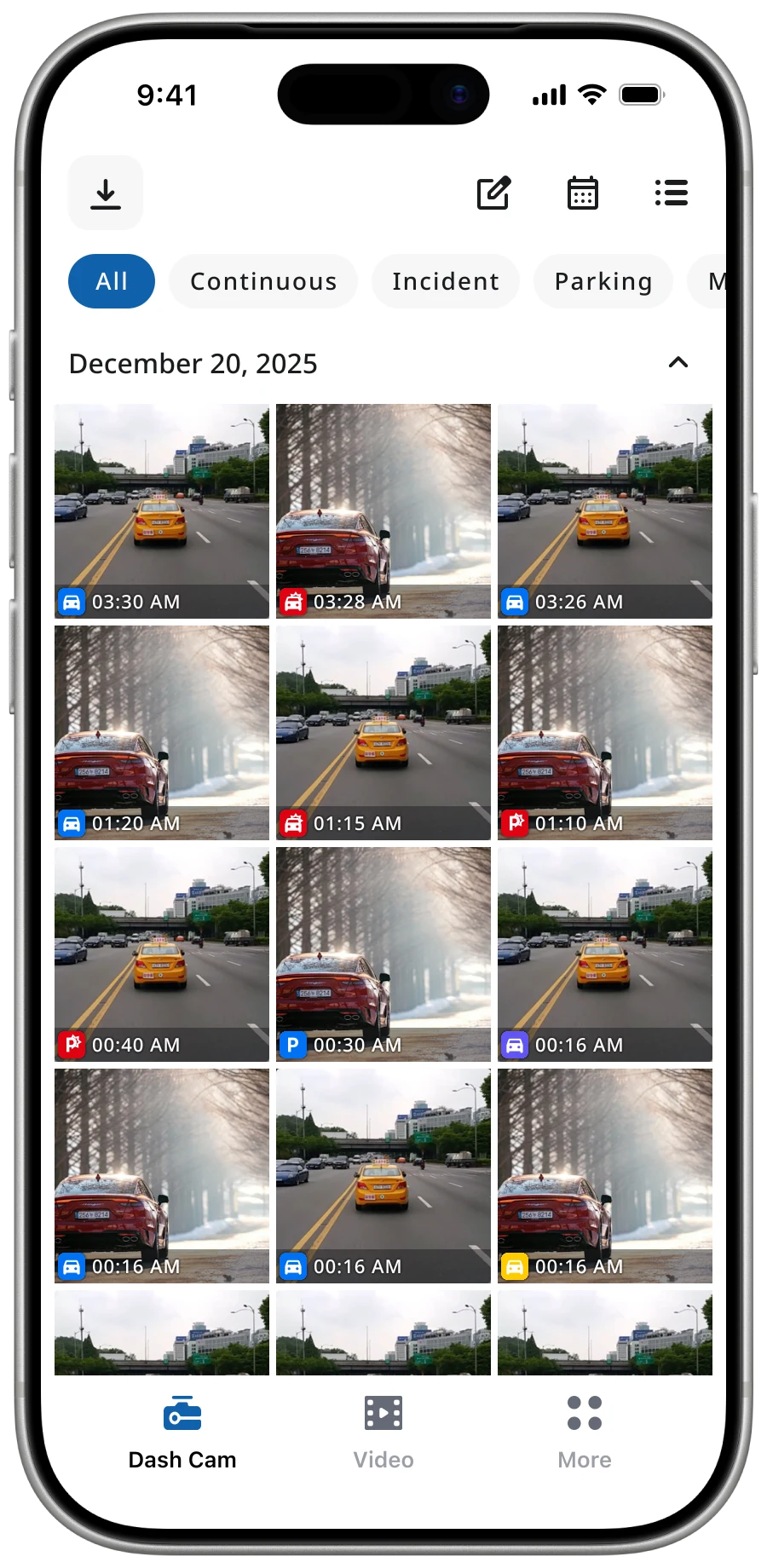
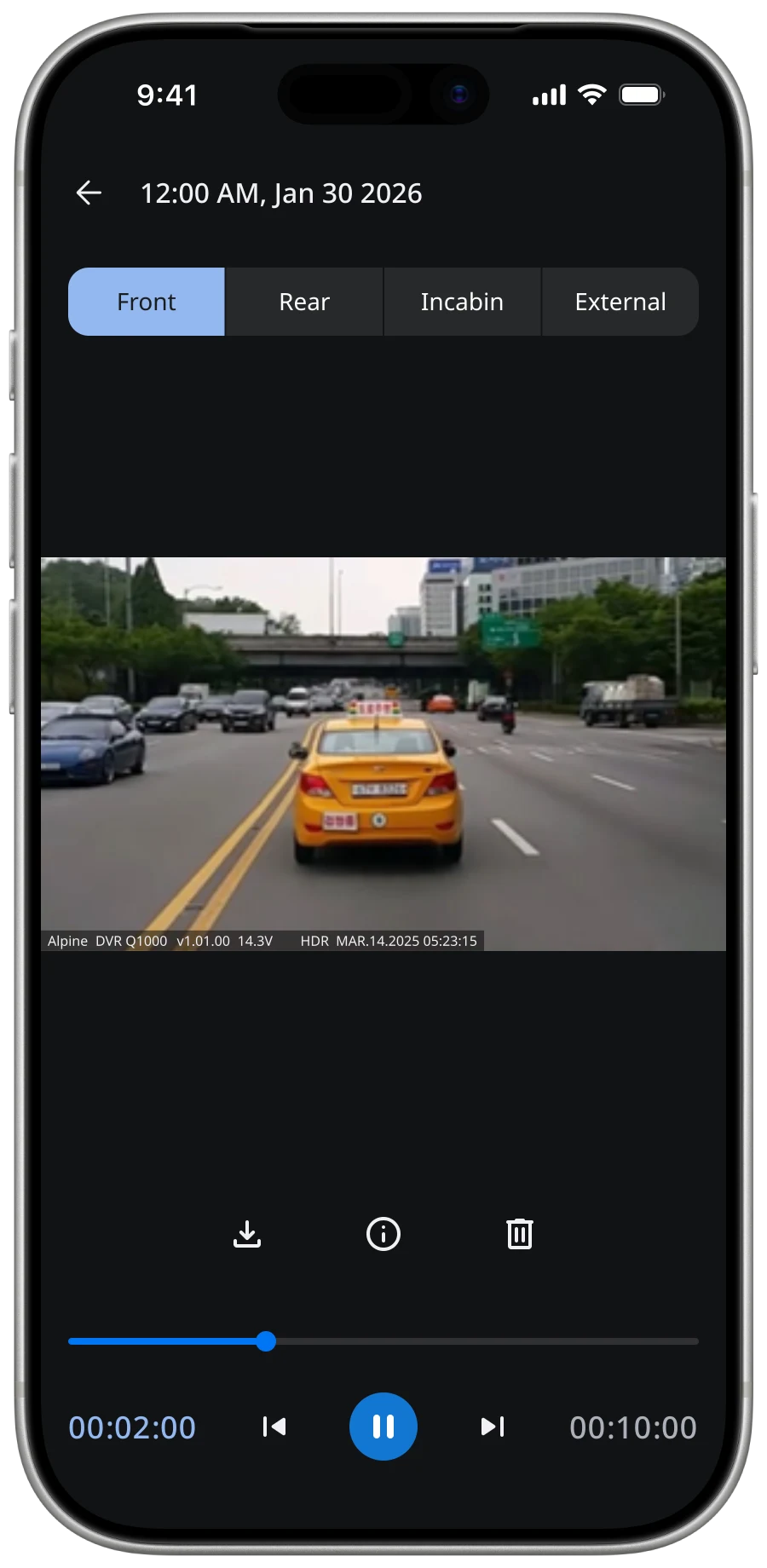
Thinkware Dash Cam LINK connects more than 100,000 drivers worldwide to their in-vehicle cameras. Years of incremental updates for new models had left it dependent on a fragmented legacy architecture, making connection, loading, and system feedback increasingly inconsistent.
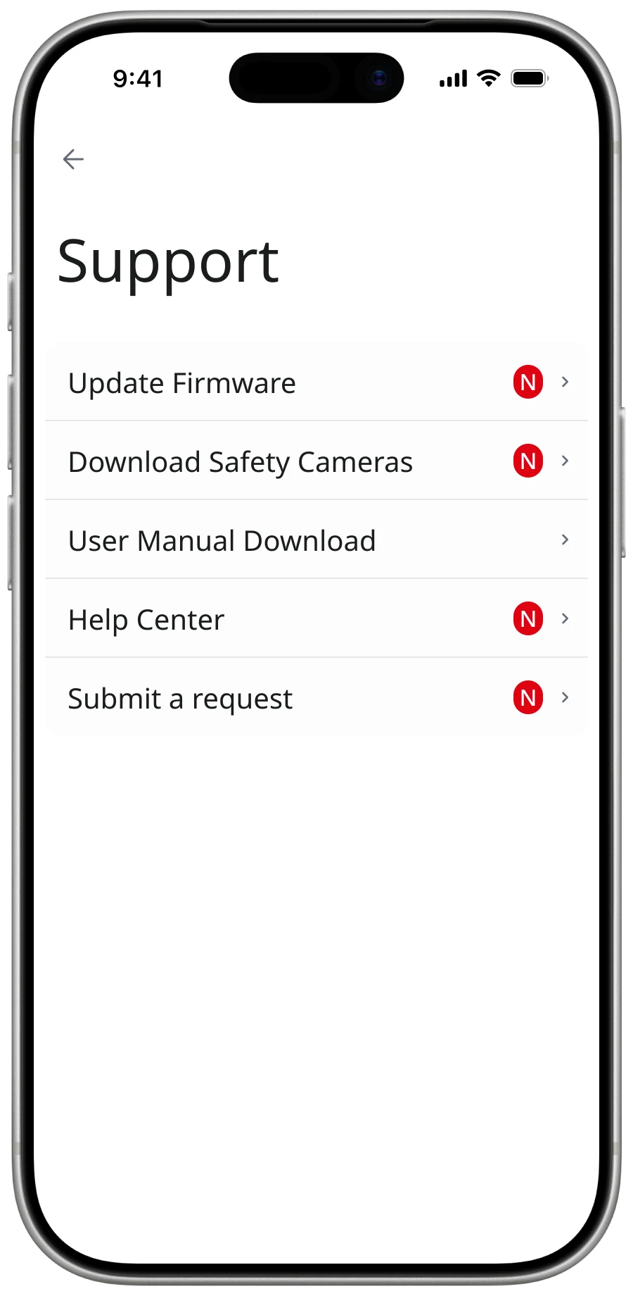
I worked as the sole UI/UX Designer in close collaboration with the BA team, native engineers, QA, and Korea HQ. I audited the product, mapped constraints, defined interactions, established a cross-platform design system, and documented the experience for delivery.
Diagnosis
Users experienced slow scanning, unstable connection, delayed video loading, and technical configuration they had no reason to understand. These were not isolated interface defects; they emerged from varied camera models, connection methods, hardware limitations, and an ageing foundation.
I mapped opening, connecting, and viewing against the underlying scan, handshake, and fetch processes. This exposed three bottlenecks—slow discovery, unstable connection, and load delay—and showed where guidance could reduce uncertainty even when the constraint remained.
User action
what the driver does
open app
connect
view video
System process
what the app runs underneath
scan
handshake
fetch
Bottleneck
where the legacy foundation breaks
slow scan
unstable connection
load delay
Bottleneck notes
Slow scan
Legacy foundation can't parallelise device discovery — Wi-Fi enumeration stalls on multi-camera setups.
Unstable connection
Bluetooth handshake drops when the phone backgrounds the app, forcing manual re-pair.
Load delay
Thumbnail decode blocks the gallery thread on hardware-constrained devices, freezing the list.
Strategy
Dash cam use is situational. Drivers may ignore the app for long periods, then open it after an accident when speed and certainty matter. Its core job was not general video management, but reliable retrieval under pressure.
Dash Cam LINK is not a UI problem. It is a system problem.
I used a Painkiller-versus-Vitamin lens to prioritise the redesign. Reliable connection, loading, playback, and retrieval were the painkillers. A modern visual language was supporting value. Success shifted from feature completeness to time-to-retrieve, from visual polish to reliability, and from navigation depth to direct access. Changes that did not support the critical task were deprioritised.
Decisions
Keep connection state visible
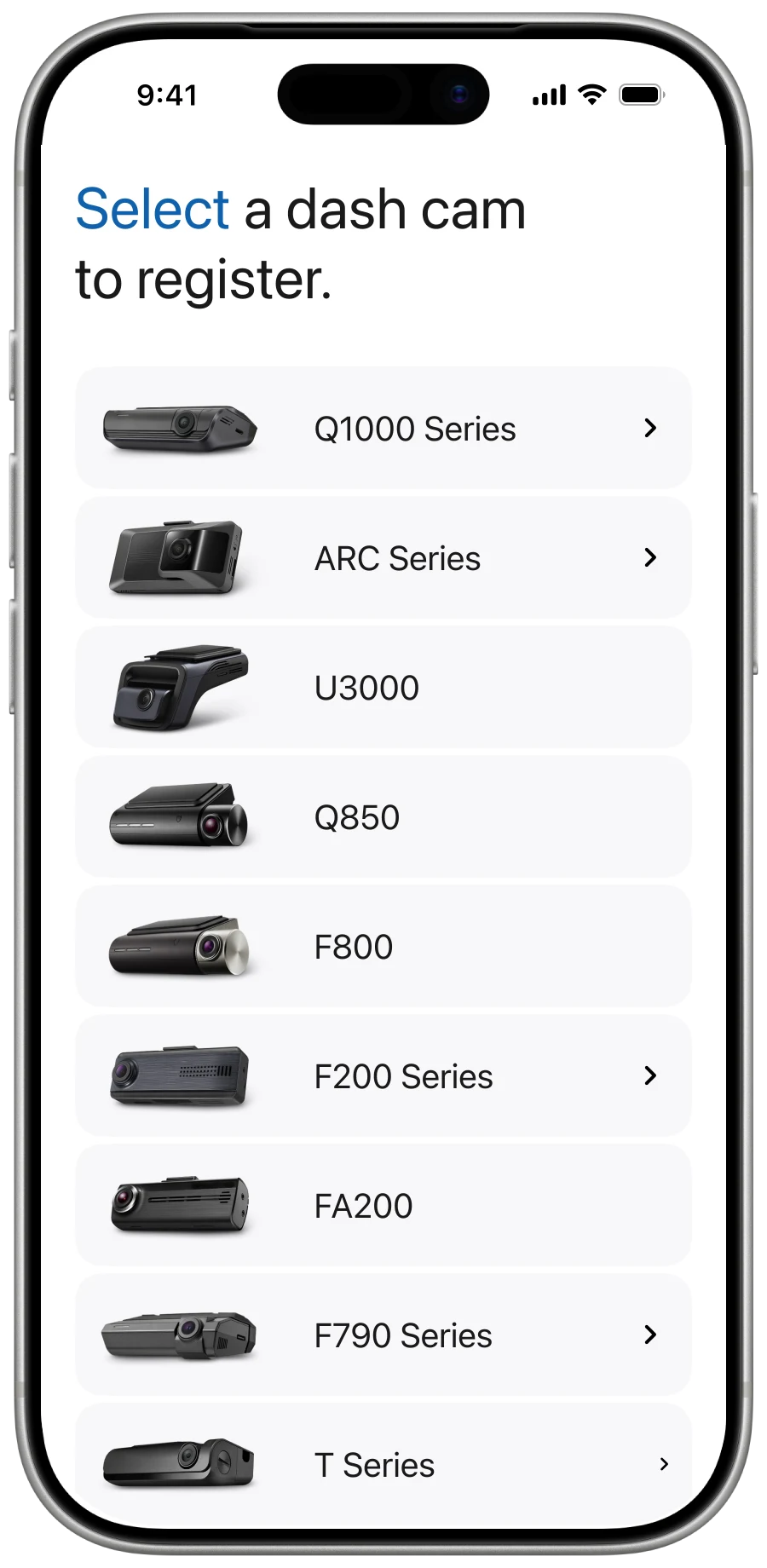
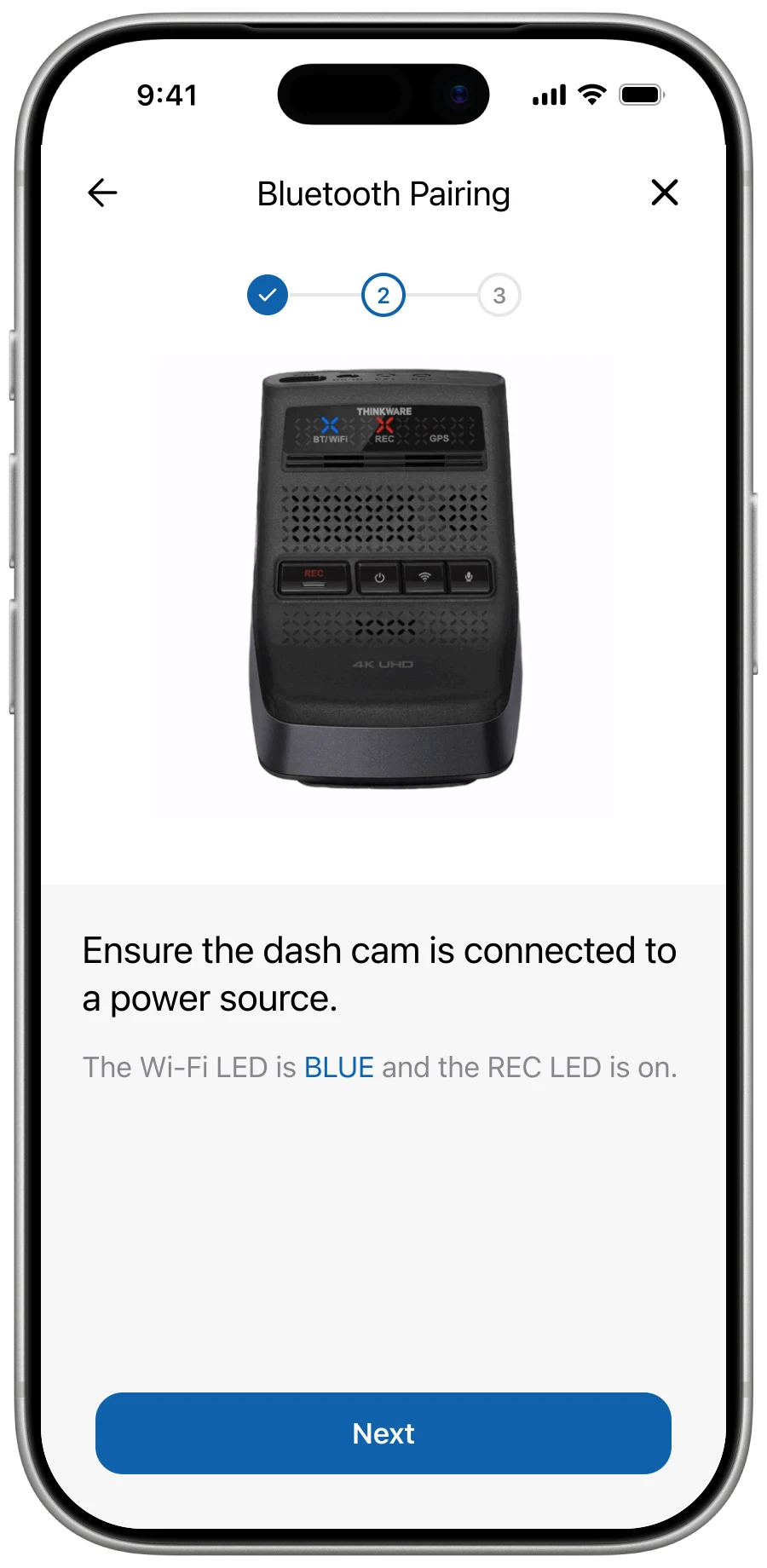
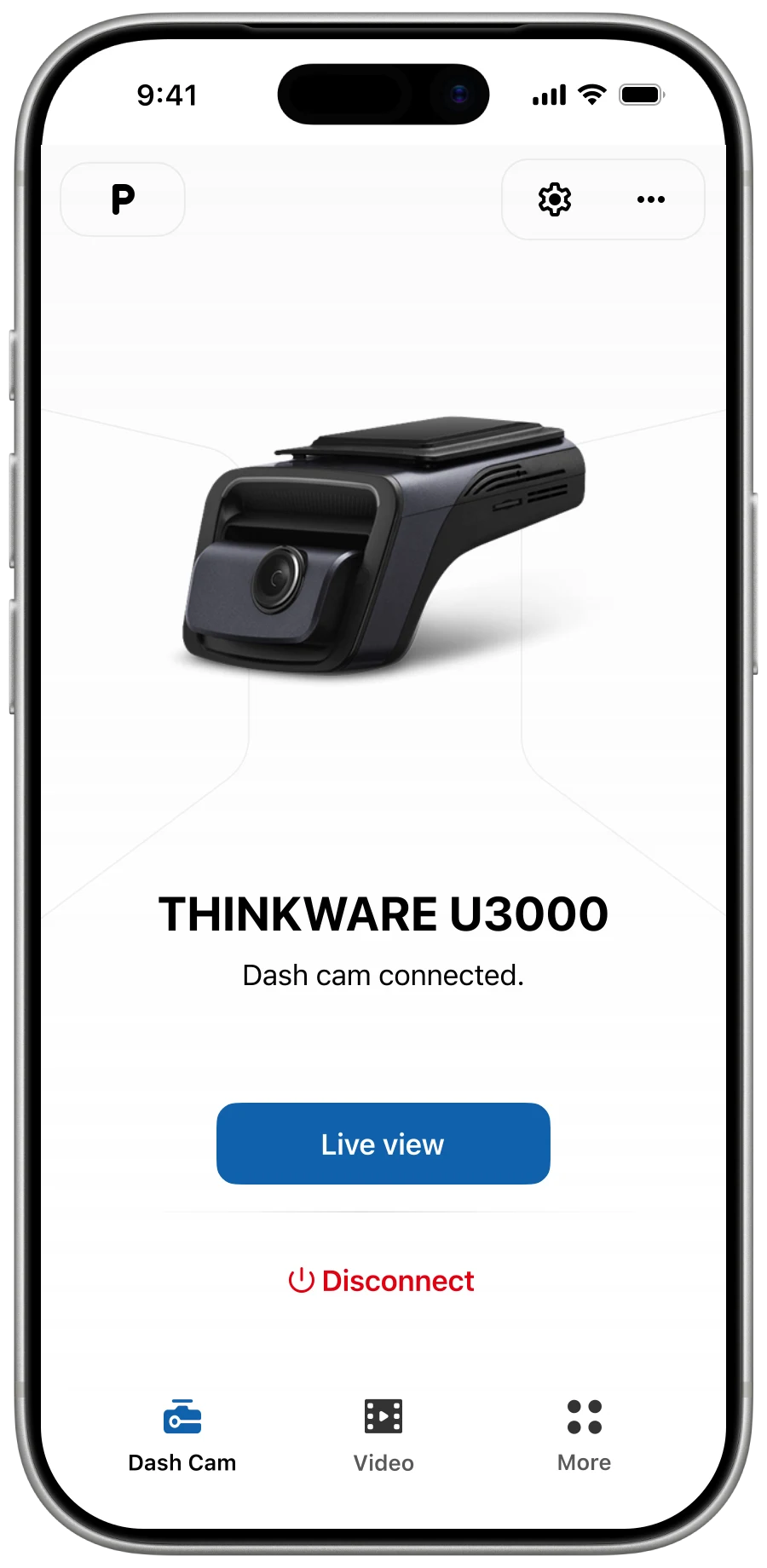
Different cameras and connection methods created varied setup paths and failures. I designed guidance for Bluetooth, Wi-Fi, and QR code, auto-reconnection for paired Bluetooth models, and explicit feedback across scanning, pairing, failure, and retry. The interface could not remove complexity, but it could prevent silent uncertainty.
Engineering had to maintain more edge-case logic across camera models and connection methods.
Activity flow
Branches
Auto-reconnect
IdlePairingPreviously paired Bluetooth cameras skip Scanning, Discovered and the Connection guide — straight to Pairing on app launch.
Guidance
ScanningHelpStalled scan offers a Help branch with model-specific instructions and connection-method picker.
Error retry
Error guidePairingEach error mode has a specific labeled cause and recovery steps; once resolved, the flow loops back to Pairing rather than restarting from Idle.
Organise retrieval around the incident
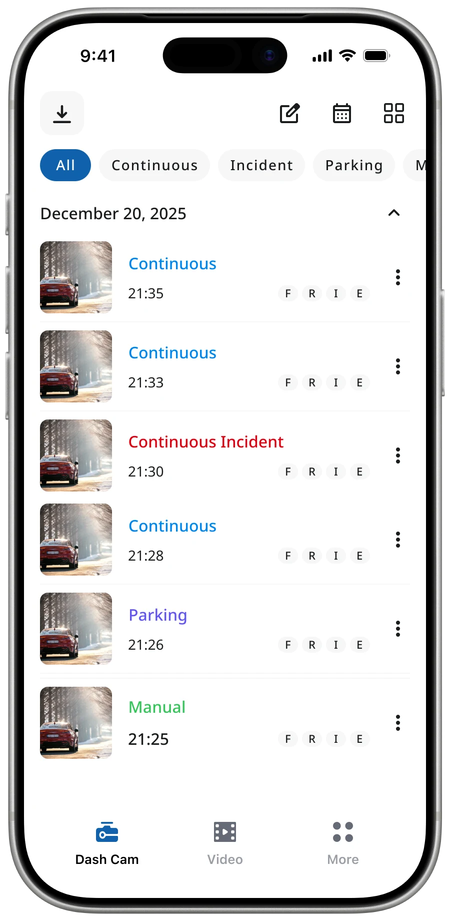
The legacy gallery used rigid folders and repeated information across camera-angle views. I proposed grouping related clips around the incident and exposing camera angle as a tag, reducing navigation between an event and its footage.
This prioritises incident retrieval over browsing by camera angle. The proposal has not shipped, so its effect on retrieval time remains unvalidated.


Respect the user's text preference
I introduced dynamic font scaling backed by shared typography tokens. Layouts adapt to OS-driven text settings, improving legibility without requiring users to zoom.
Dynamic type expanded the responsive-layout and testing matrix across two native platforms.
Capture feedback inside the product
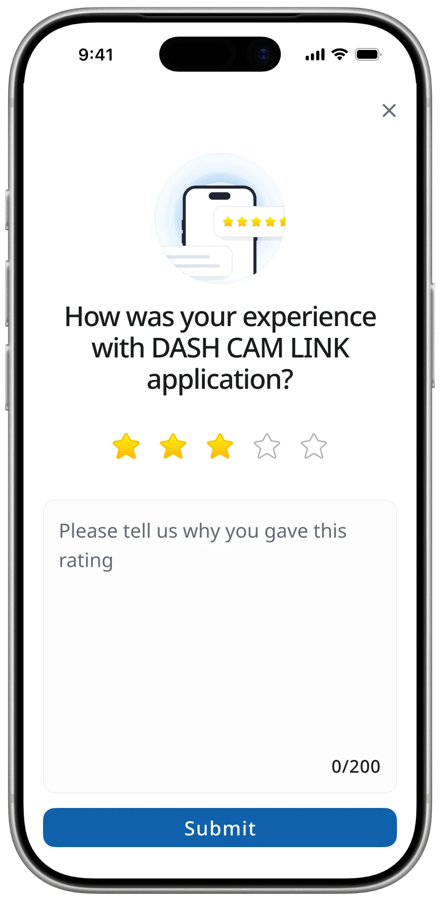
I designed an in-app rating feature to collect first-party feedback with product context. Internal data records 600–1,000 reviews per month; the figures below come from this channel, not public app-store ratings.
First-party feedback adds storage, moderation, and triage work, but gives the team a more actionable signal.
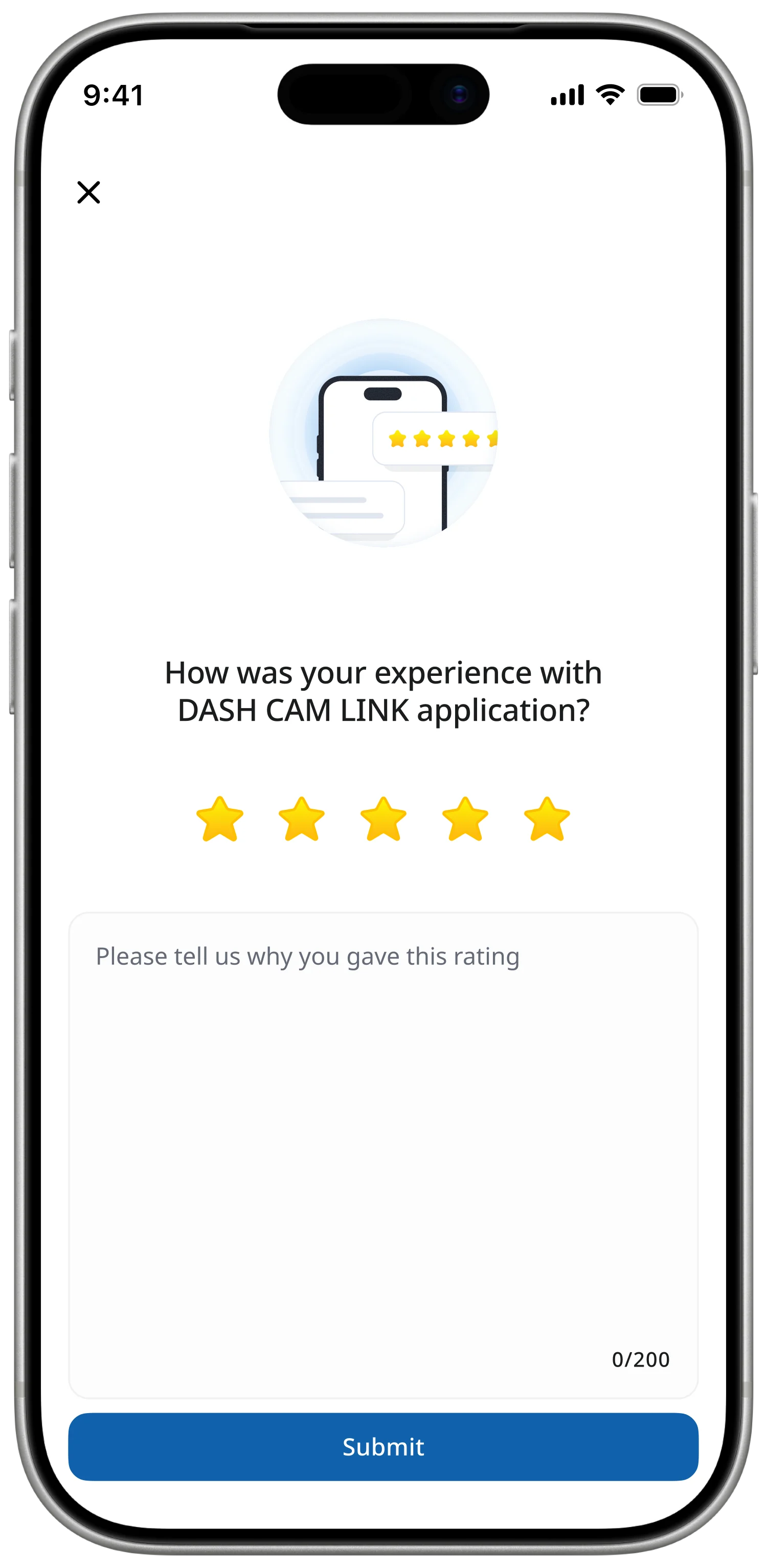
Source: internal in-app rating data, confirmed by the designer. These are not public app-store ratings. The measurement period and calculation method are not specified here.
Foundation
I used Material Design as the baseline for native Android in Kotlin and iOS in SwiftUI, with Noto Sans for multilingual consistency. Figma variables defined shared spacing, typography, and colour rules. The choice served scalability and maintenance rather than a visual reset.
- 01
System fidelity over visual novelty
Stay true to MD3 baseline — UI is not where this product wins.
- 02
Android-first, iOS-aligned
Tokens validate on Kotlin first; SwiftUI inherits unchanged.
- 03
Refactor, don't rewrite
Components map onto legacy code so the UI ships in place.
- 20
- components
- 80
- tokens
- 2
- themes
- 2
- platforms
Color · derived from #1062AD
Typography · Noto Sans
Buttons
Filled · Tonal · TextIcon button
Standard · Filled · TonalText field
FilledList item
Featured · Actionable, 2-line- LeadingTonal blue 16% · 24 dp
- HeadlineBody-medium · on-surface
- SupportingBody-small · primary
- Trailingchevron_right
Snackbar
With actionDialog
BasicI also audited more than 100 screens and documented connection, retrieval, loading, error, and edge-case flows, creating a shared reference across design, BA, engineering, and QA.
Outcome
The released work maintained the reported internal rating figures while replacing missing UX documentation with a structured cross-platform foundation. The connection flow, dynamic font scale, and in-app rating feature shipped; the event-first gallery did not, and no released outcome is attributed to it.
The project changed how I approach constrained products: diagnose where the friction is generated before redesigning its surface, prioritise the critical user task over feature breadth, and make system state understandable when the underlying complexity cannot yet be removed.